OPEN STUDIOS APPROACHING (PANIC?)
I attended the weekly roundtable discussion to help figure out some of the matters I was stuck with last week. I was paired with Vikas and Andri and here’s a quick summary of their feedback:
For my open studio set up, whatever I had was good enough but I kept piling on additional things that made it super cluttered, cramped and confusing to comprehend. Sometimes simplicity allows people to understand the project on a more conceptual and personal level. Additionally, I don’t need to worry about materiality of the pots because my reasoning for tying it back to Bangalore is not that convincing. I also need not use the outcomes of the survey as a basis for conversation just because they are from Bangalorean people. The issue I am addressing can be applied even in Singapore, especially with its super built environment (then we went on a long discussion about the parallel of botanical gardens in Bangalore (Lalbagh) and Singapore and how the flora and fauna is exchanged and interchanged between them.
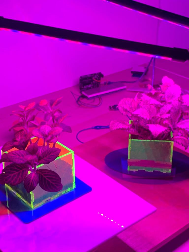
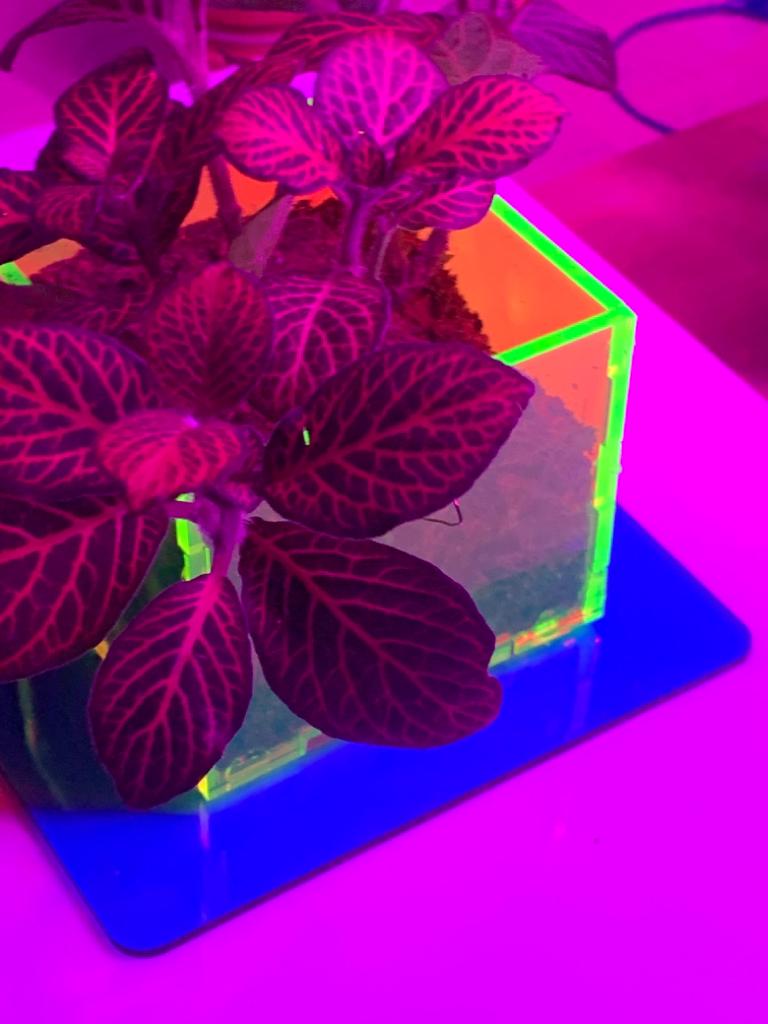
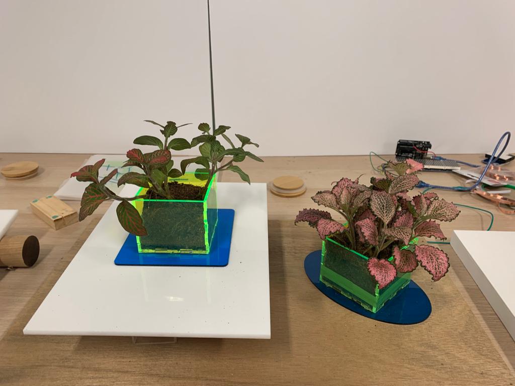
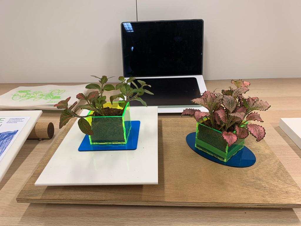
Okay, cool! I think I will stick to acrylic then and really simple acrylic boxes through which you can see the soil and maybe the roots of the plant. Acrylic again is very futuristic to me.

I tried to get some semblance of a prototype done but here are the issues I am facing that I cannot solve:
There is a whole 30 delay between the participant touching the plant and then getting a response. Revisiting the dynamics of interaction as defined by Mikael Wilberg, no one will have the patience to wait so long to receive an output. Additionally, some really quick gestures like single tap in the middle are lost completetely due to the delay.
Additionally, teachable machine is slowing down the entire code and there will be at least a minute delay between starting the code and seeing effective results. I have so many technical issues that I need to sort out but I feel like I keep moving forward anyways and then they keep piling up/ become so complicated it would be a mess to introduce all this to Andreas and get him to debug it.
Feedback during our dry run test:
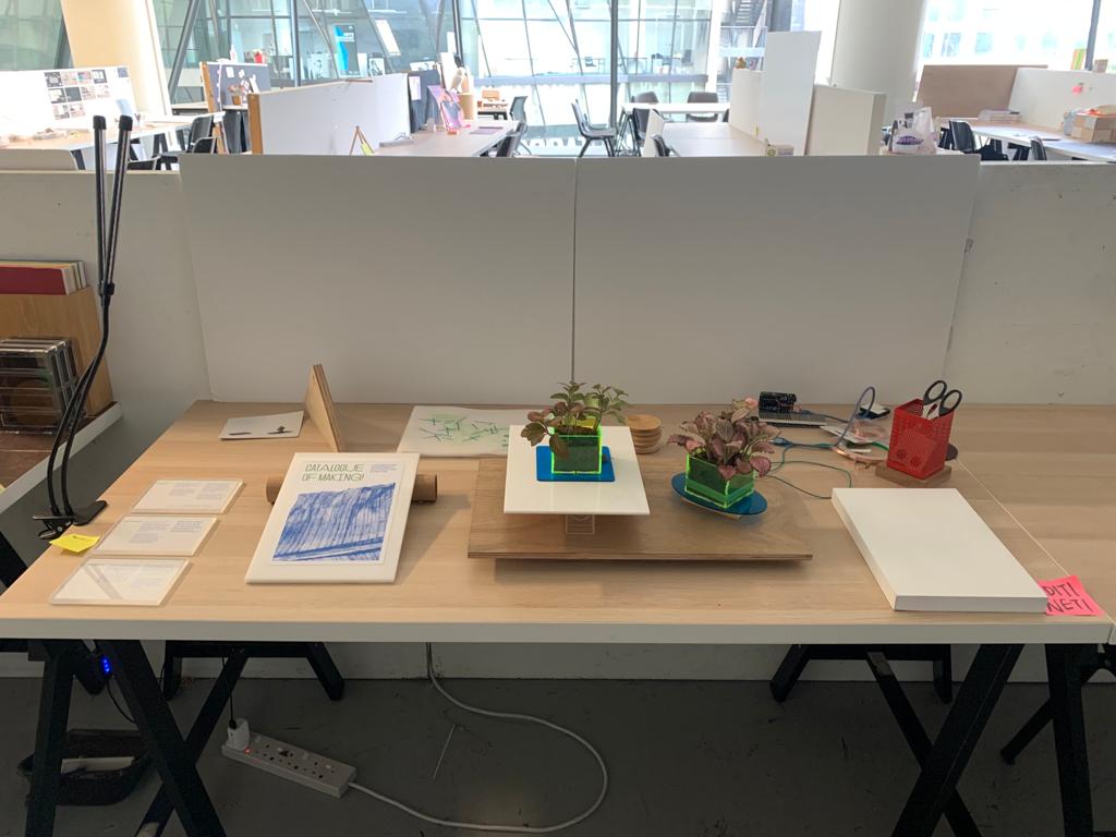
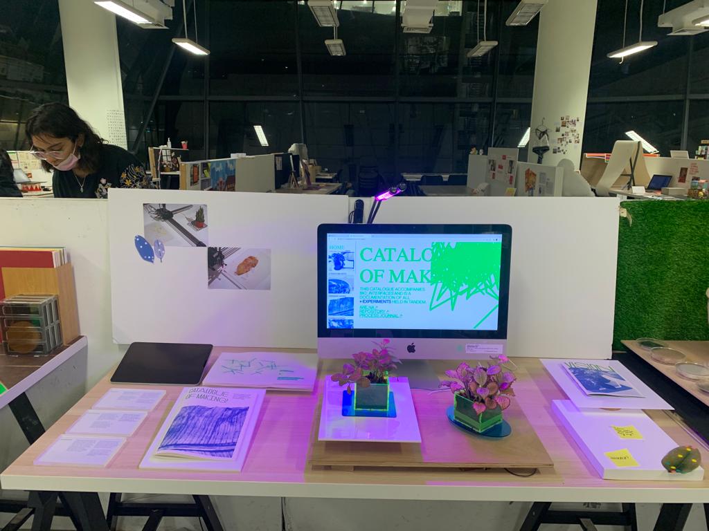
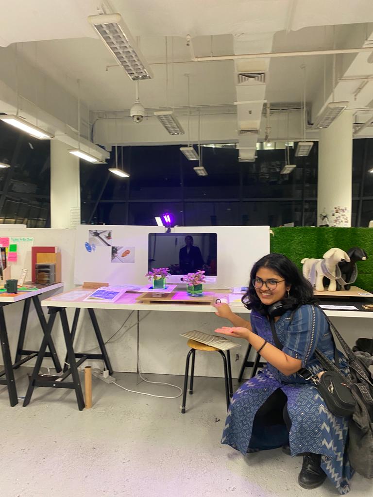
Not good! Here’s a pick of my setup.
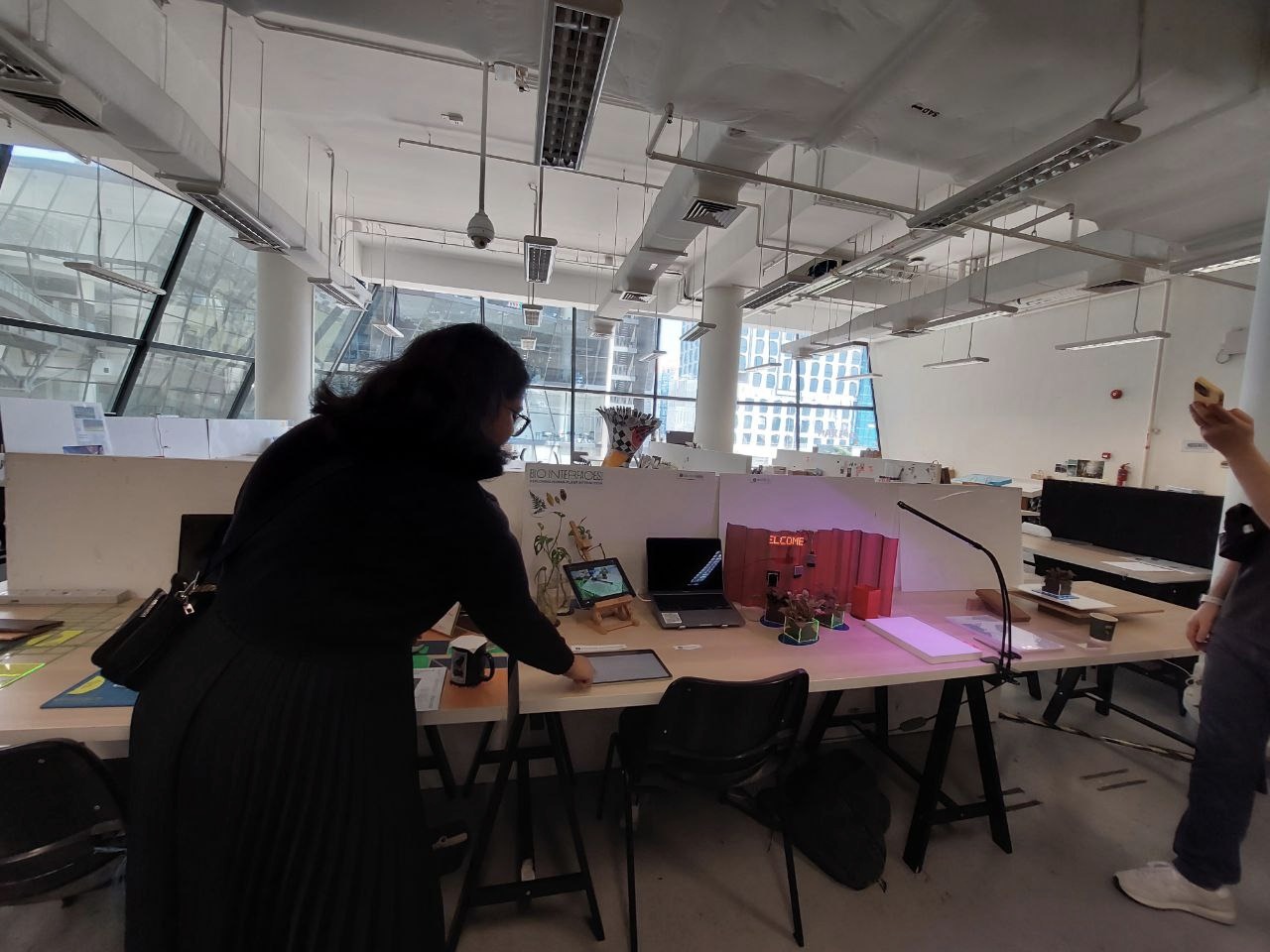
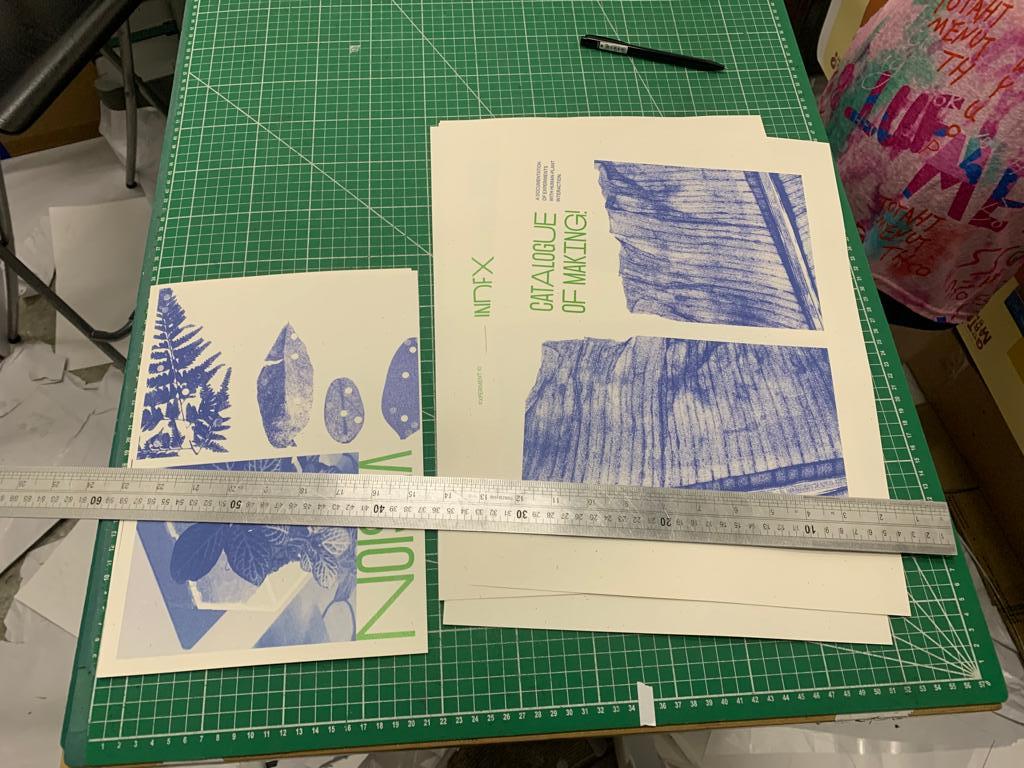
No clear introduction, starting point or pathway for the table experience. I have too many plants on the table, not necessary, just because my project is about human plant interaction Can omit labels Can reform my catalogue of making website into a publication because no guest or visitor will actually take the time and effort the scroll through and click on every single page. Too many screens! General table presentation can be better: so many different materials being used: wood, glass, acrylic, spray-painted red metal Can focus more on the Axidraw prototype and specifically its outcomes, aka the translucent sheets that I drew on with Posca markers last semester. I am generally a bit behind in my work. During my presentation, (the comedic timing of this is so funny and absurd) one of the makeshift LEDs i had pasted onto the screen fell, which really solidified my unpreparedness
Andreas and I sat together after that and prepared more of a clear and concrete plan as to what I should aim to achieve in by open studios. I decided I would also make a small publication outlining the ‘vision’ of where this project is going in the next few weeks and what exactly I hope to achieve. Here’s the brief outline:
