ACCELERATION AND EXECUTION
New (last minute) Direction!
Last week I decided to order some RGB TFT screens from Shopee to use as a means of hosting the visual output or visual language. I think my main gripe with using a projector is the portability and the huge constraints, but I did like that they brought the visual output to the same spatial area of the tangible input.
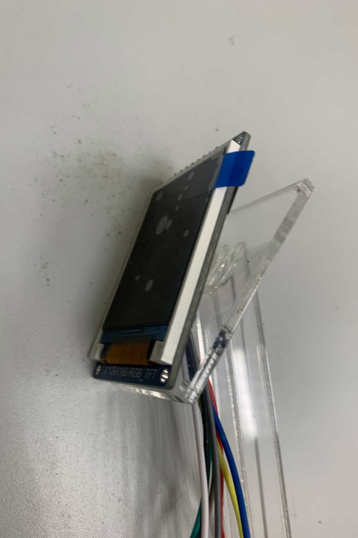
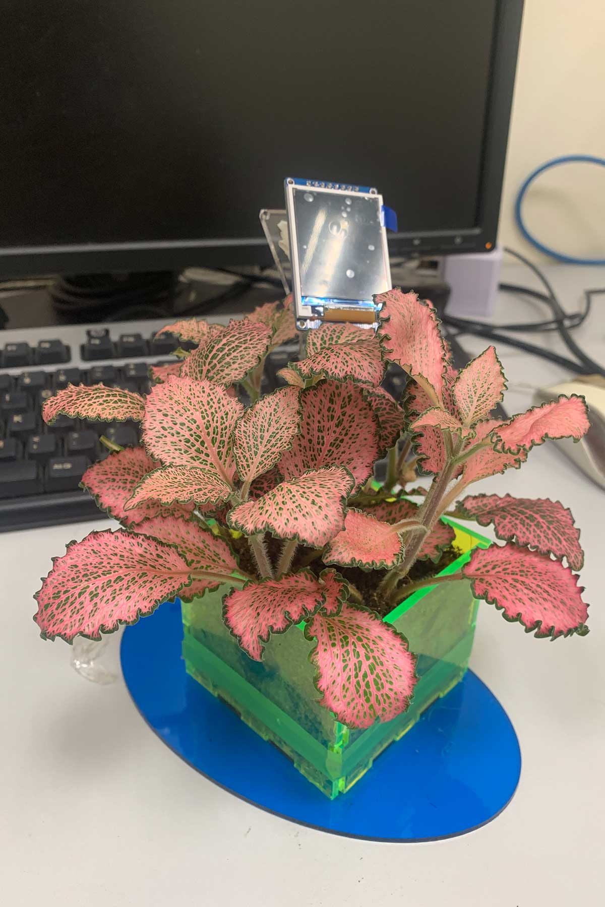
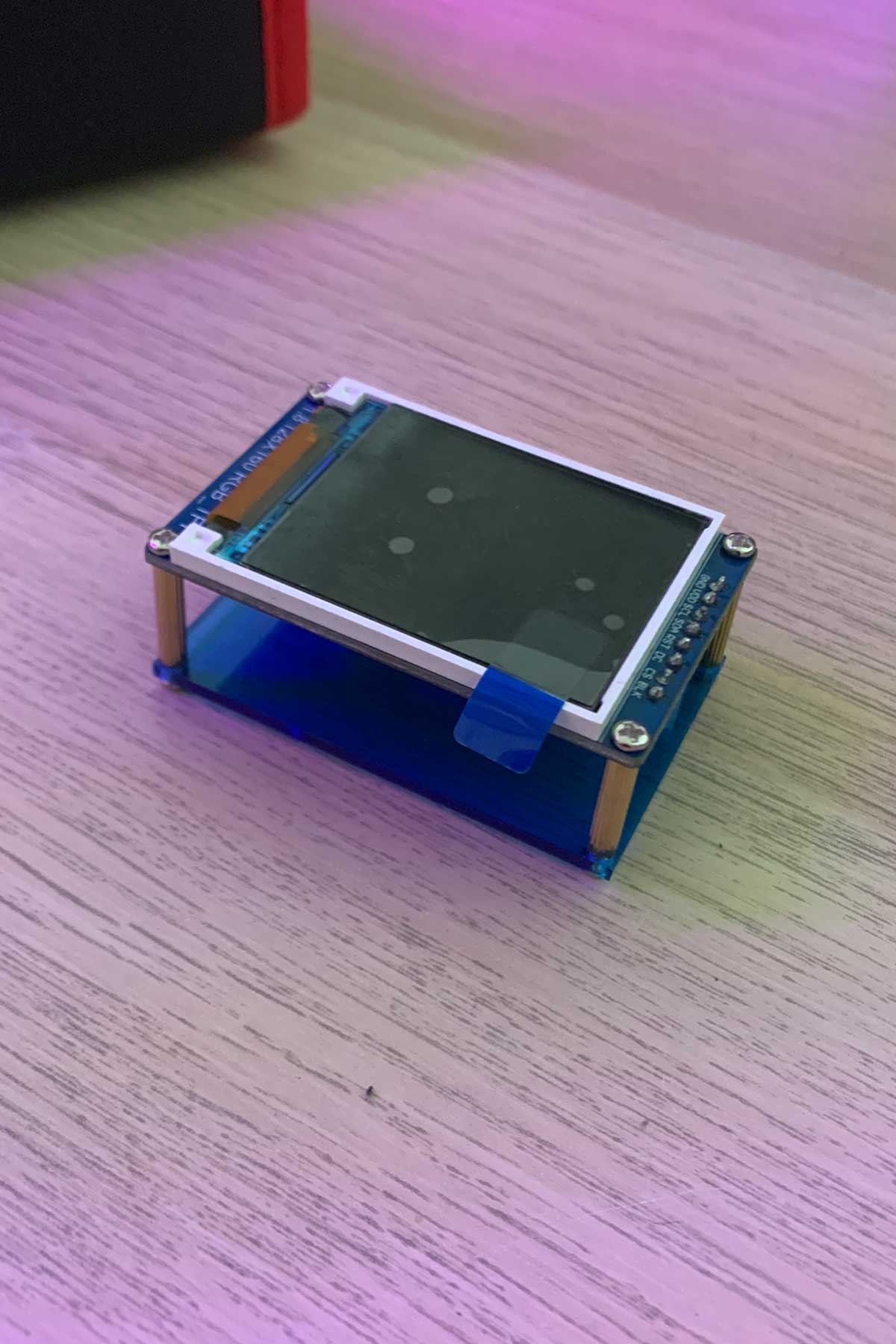
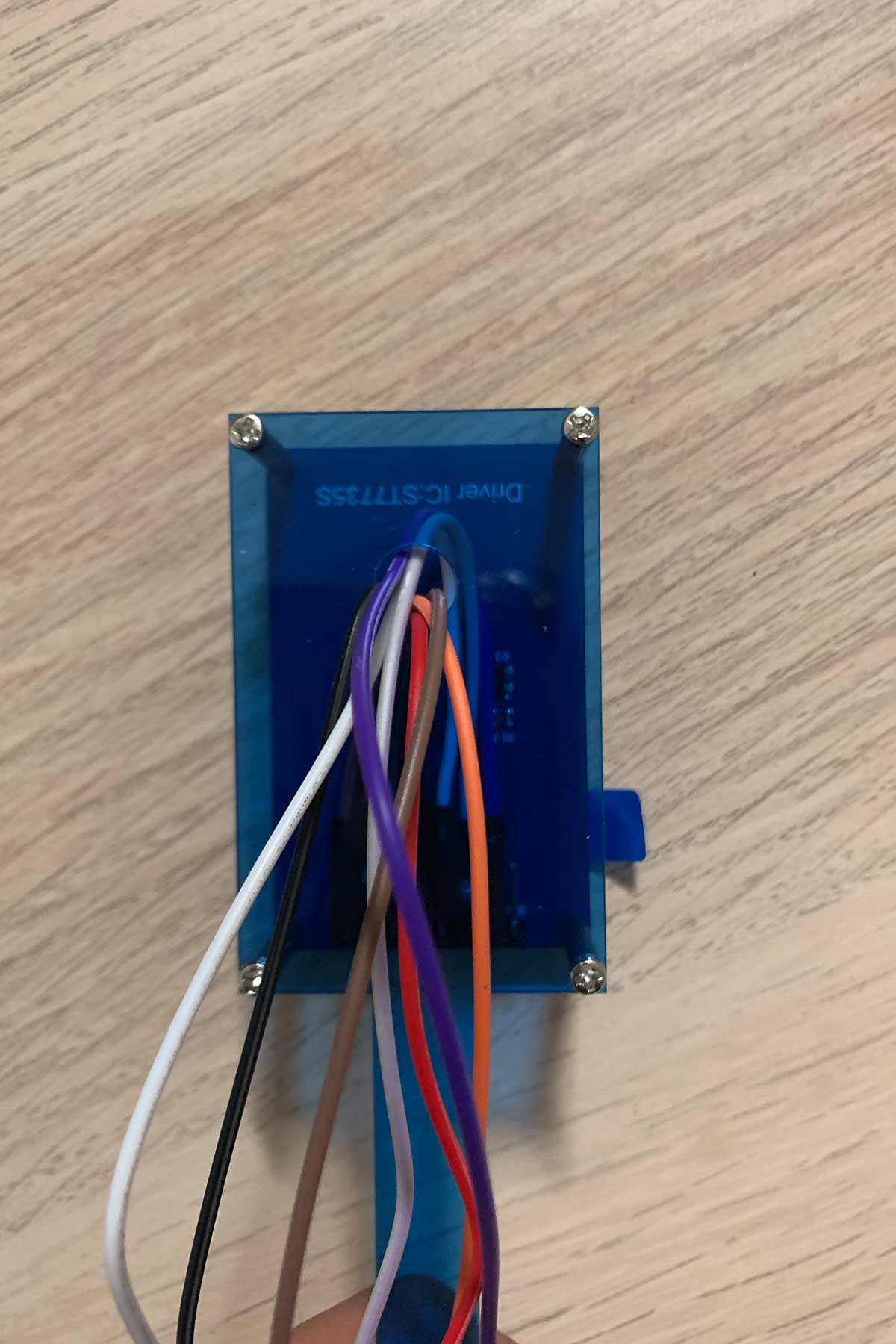
These screens came this week which was great. I did have to solder them together but I think I will definitely implement this for my second prototype: I like their size, I like how intimate it seems, and lastly, I think they can sort of integrate themselves with the plant in a potentially successful manner!
First, let's figure out how to incorporate these screens into the form of the plant and pot.
Visual Language
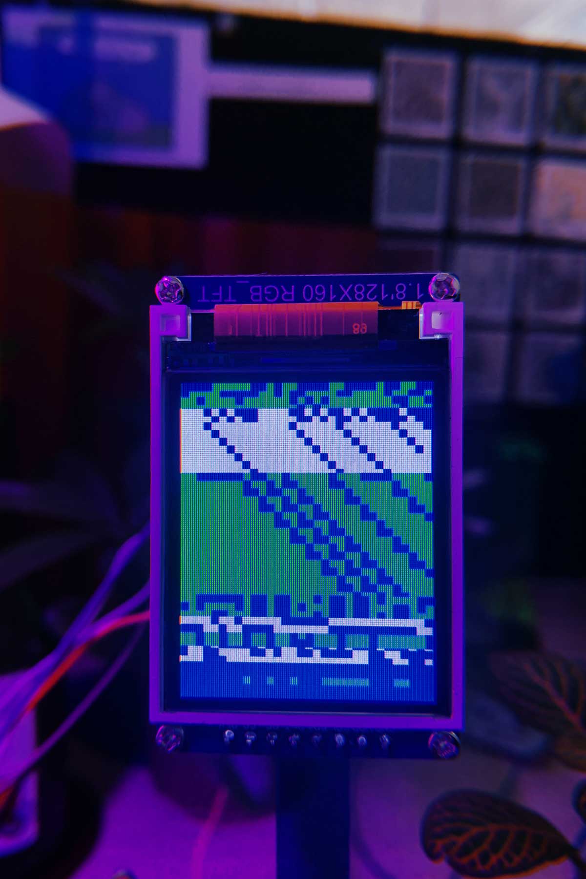
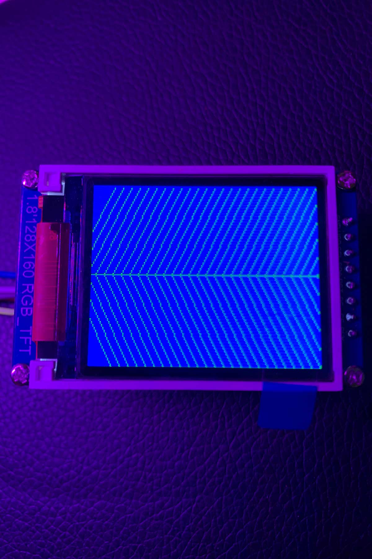
I also thought a bit more about the visual language. Last week, I was going to use the roots as a potential visual language, by using projections as a medium. I think I can definitely build on that idea of using something that is relevant to the plants themselves as an official language: just like I used roots (because plants communicate via the rhizome.) I decided to revisit the aspect of cellular automaton that I explored last semester.
I think the rationale for using cellular automata as a visual language is quite legitimate because it’s an algorithm that is applied in computer science and engineering, but also appears and occurs naturally in nature. The patterns are visually appealing and they also have a certain level of complexity that can be adjusted according to different plant inputs.
Cable Management
Man, they should turn cable management into a degree itself.
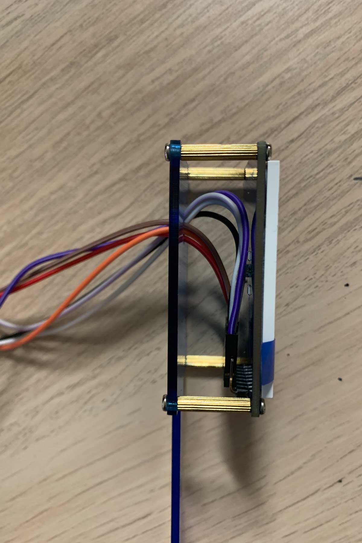
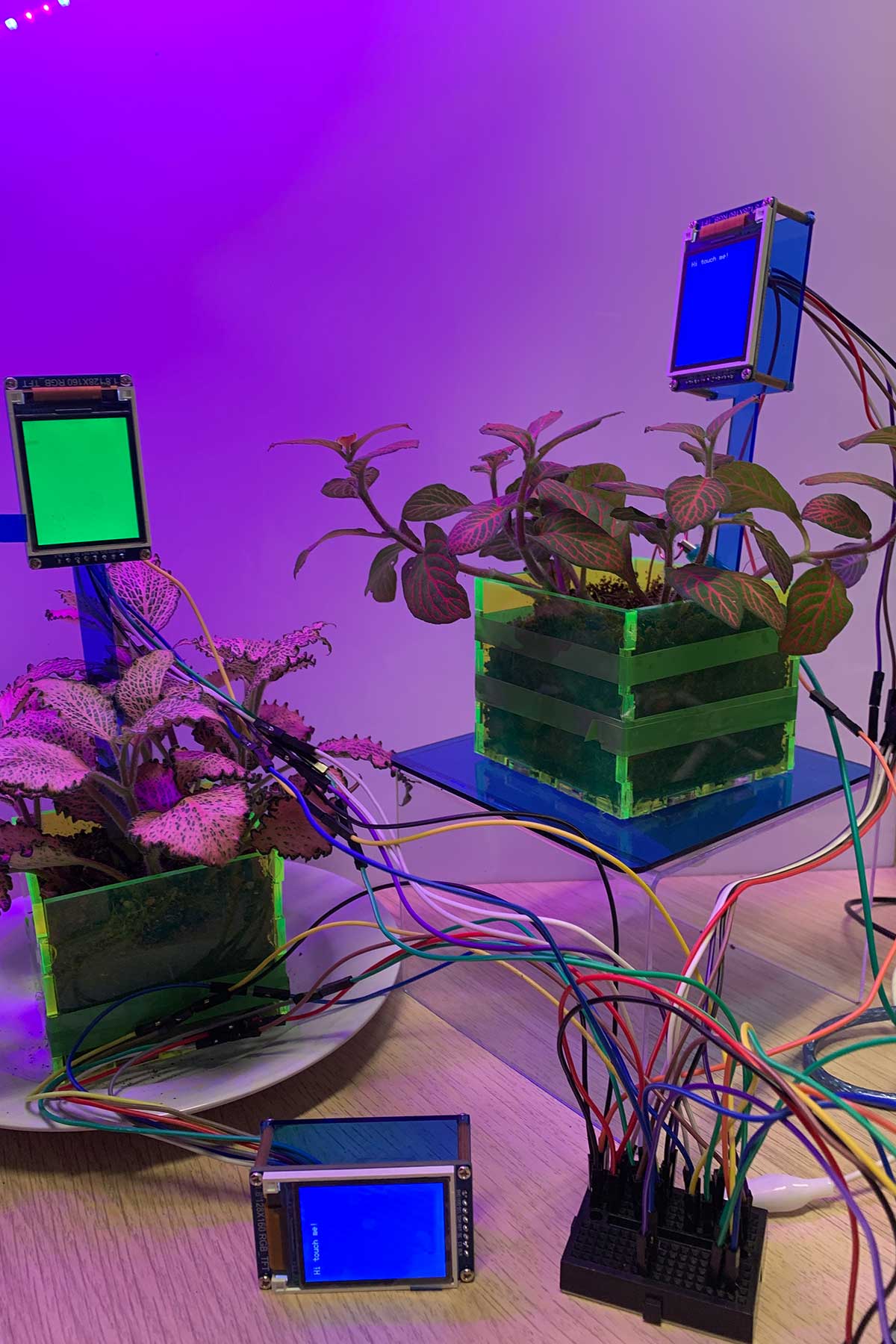
Now, each RGB TFT had 6 pins, and I had 3 TFT screens, which meant 18 separate wires to deal with! If I let the wires fly loose, I would end up with a prototype that looked 90% wires and tech and 10% plant, which was not ideal. I needed to soften and neaten the addition of the TFT screens because otherwise they would be extremely intrusive.
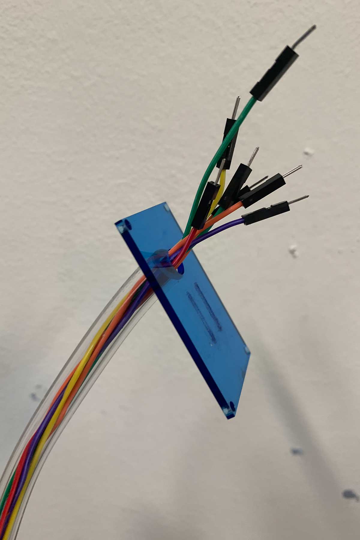
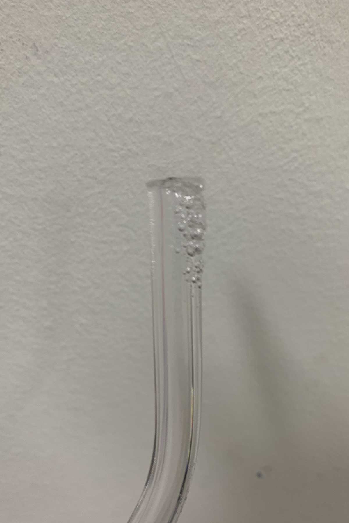
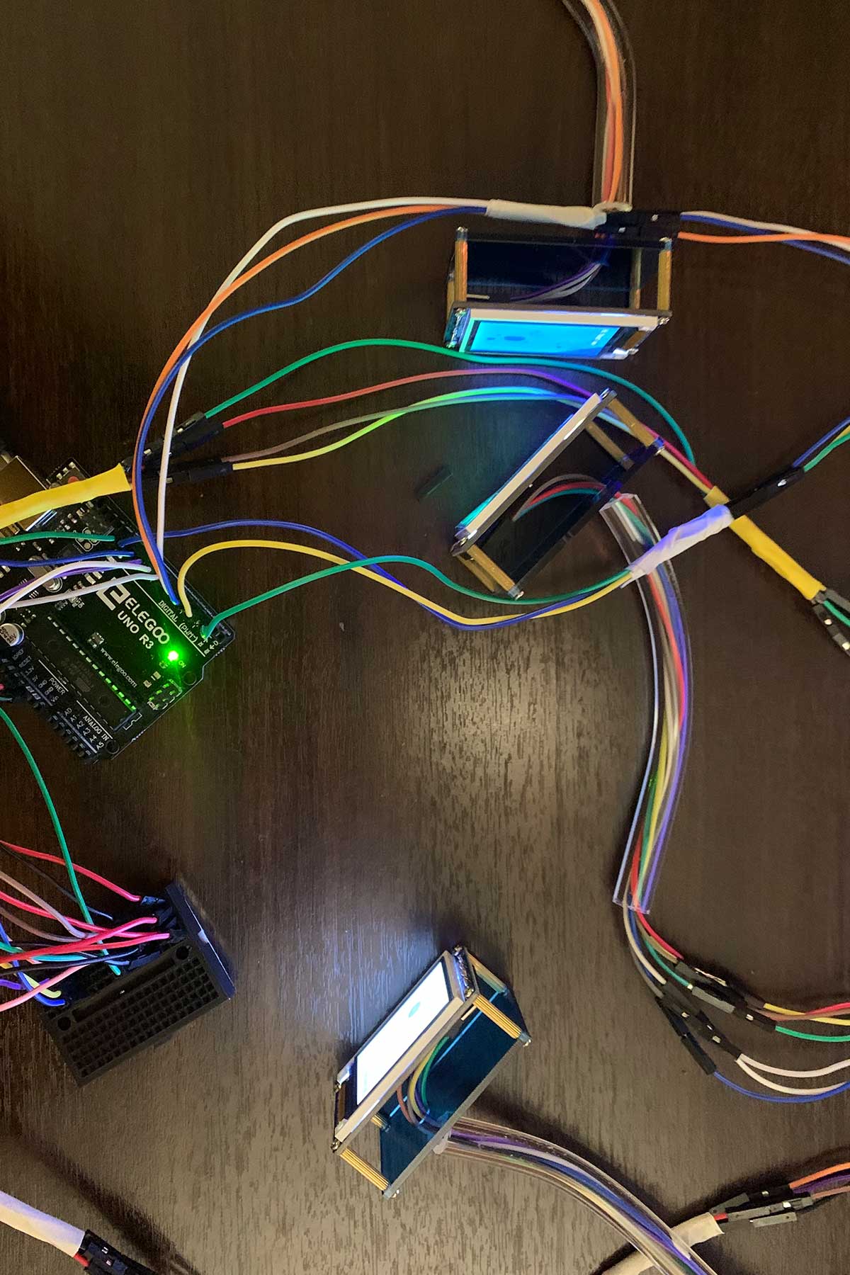
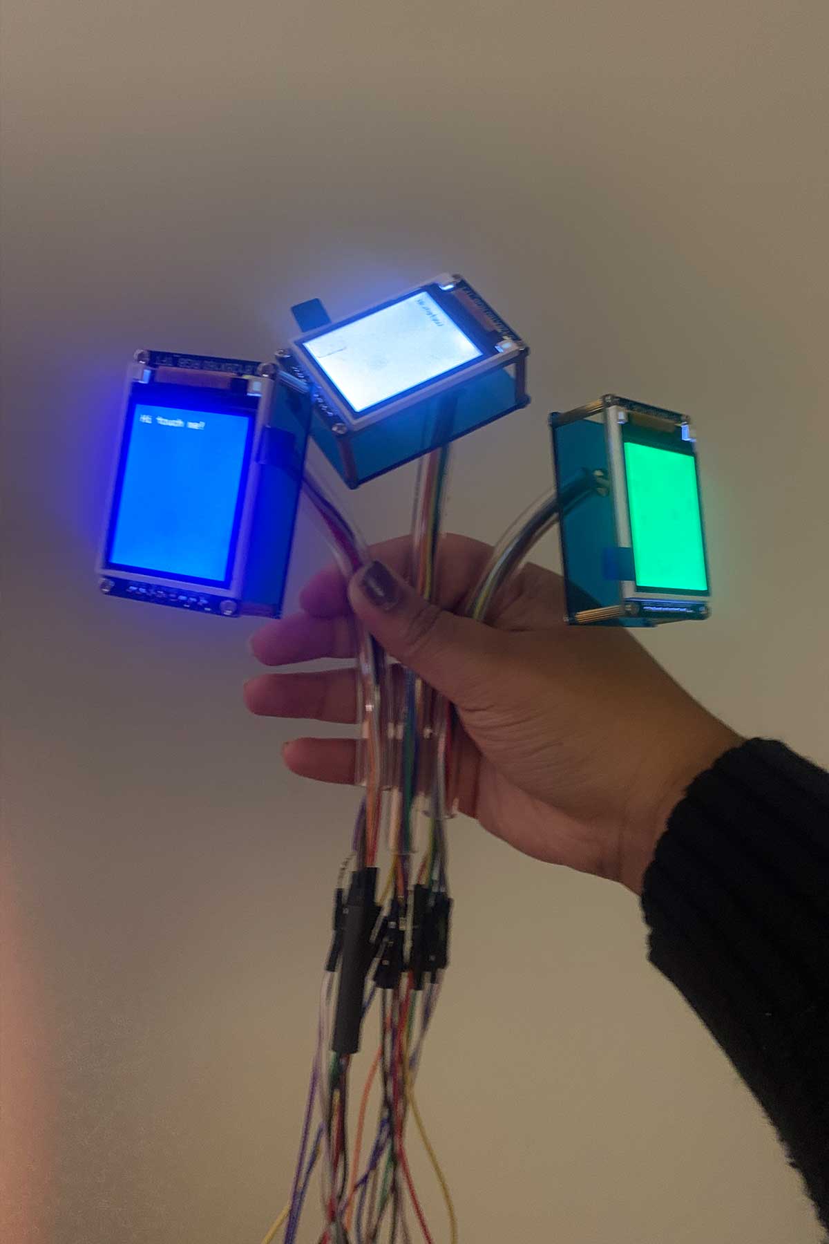
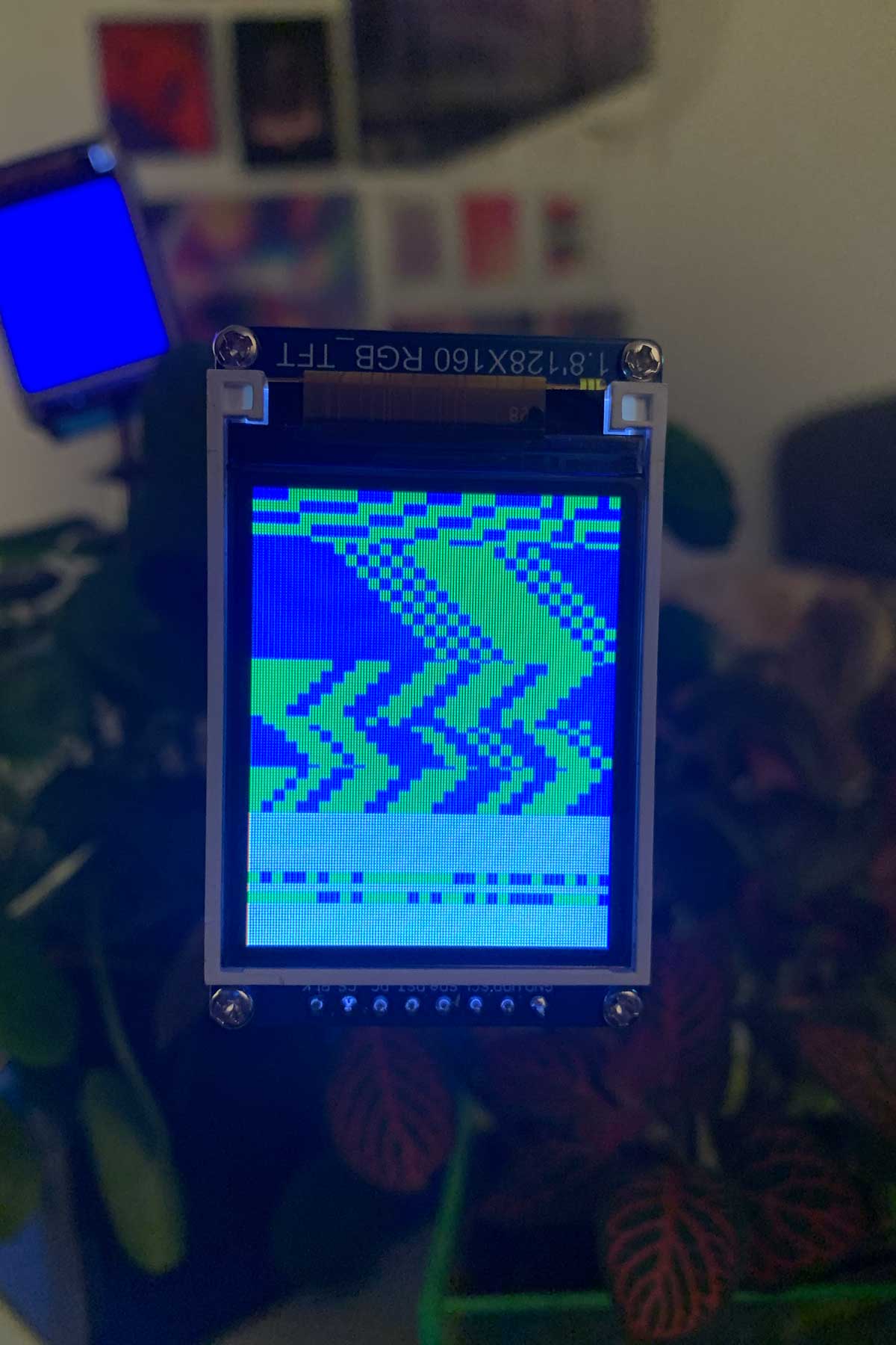
I'd like to say I worked pretty fast and was super efficient, but I think it was mainly the sense of urgency that was driving me.
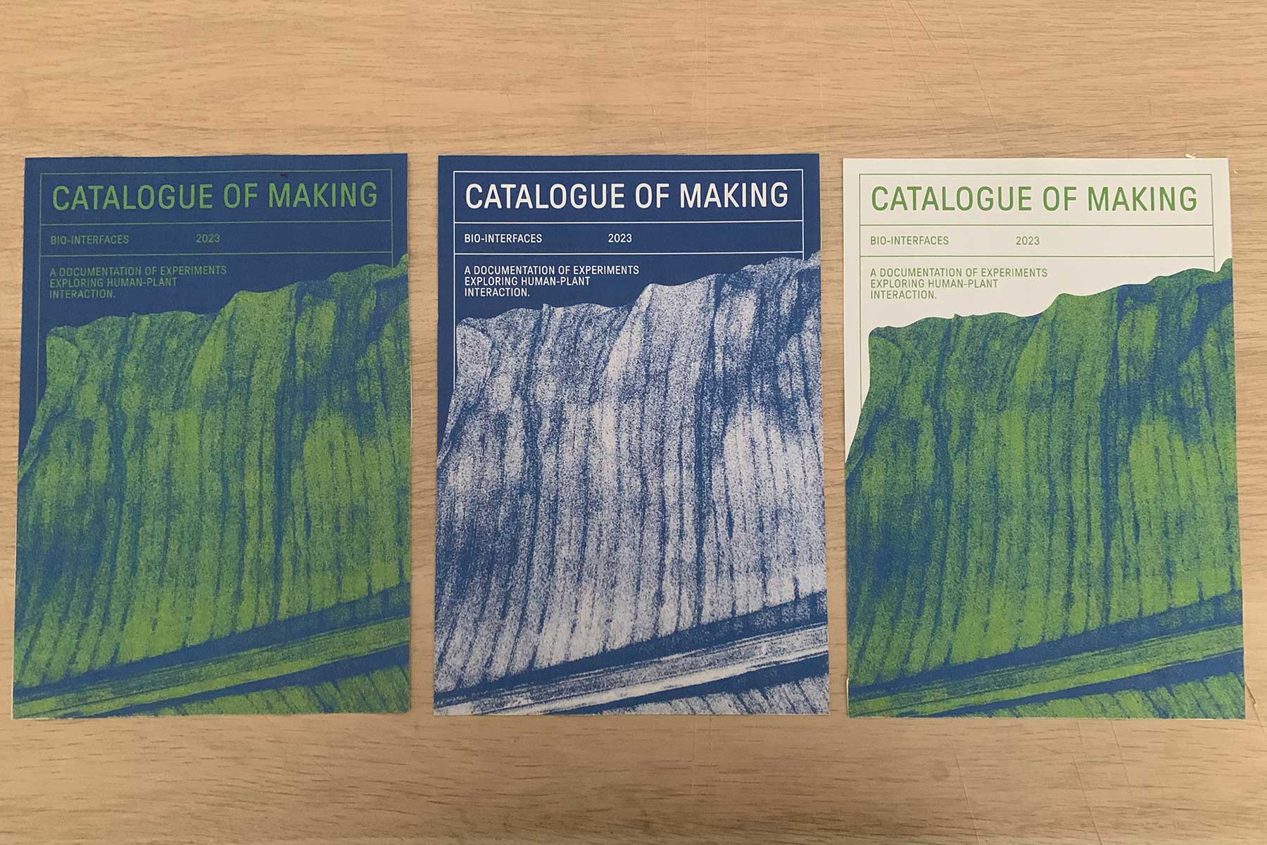
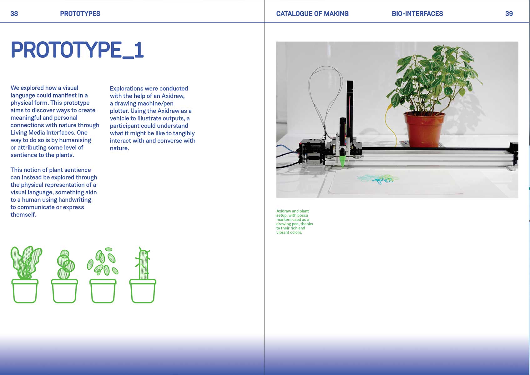
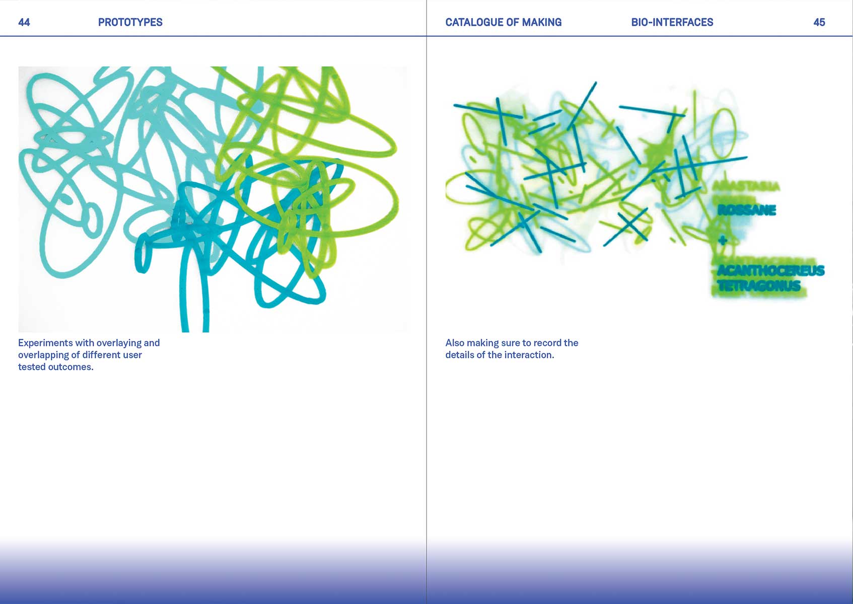
Catalogue of Making Revamp, and Art Direction
I decided to change my art direction slightly because I felt the previous typeface I was using, Formula, was not the most appropriate for the project: it had a little too much character. The stretched type also was gimmicky.
I decided to go with using an Indian typeface: Weissenhoff Grotesk, which was smooth and rounded while also being quite present and condfident.
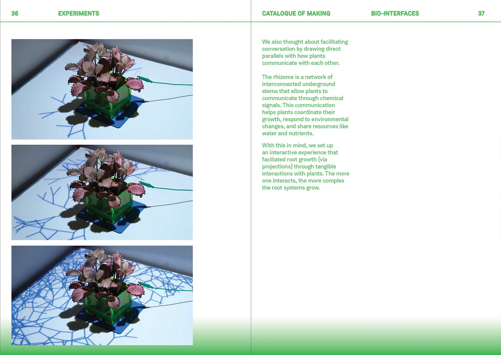
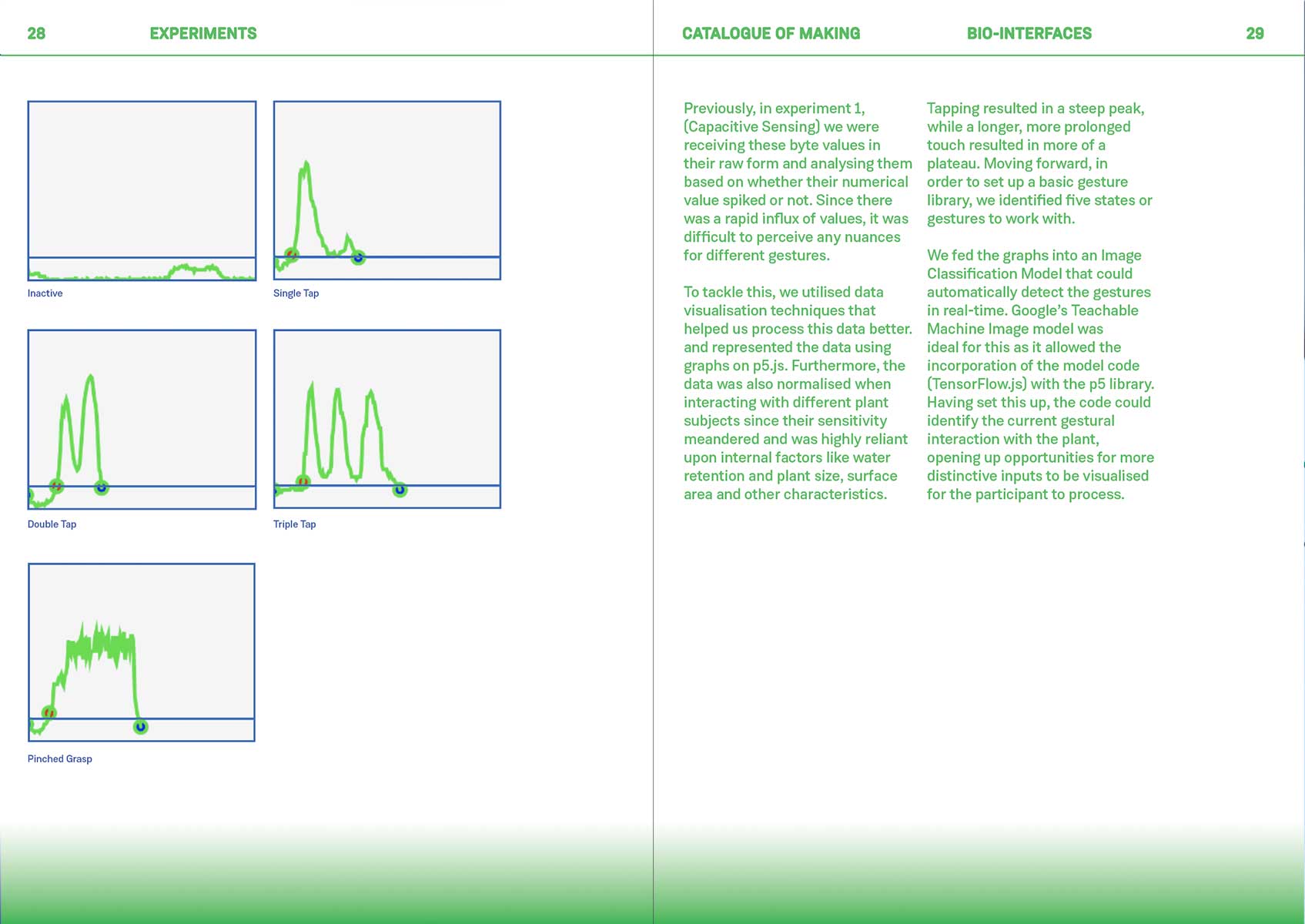
I decided to redo my layouts slightly as well, introducing a gradient background to help provide some sense of stability to the composition.
Final Reflections
I have one week left and so much to do that at this point I have turned into a machine that only executes. Maybe that's a good thing? Sometimes I overthink things and waste time.
Currently, I am quite happy with the prototype because it seems to be quite functional and looks sleek. I think it's simple yet shows complexity and diversity in visual output, which for me, is ideal. However, I am missing solid documentation and I have yet to make a video about how it would be used, so I booked a photography studio at Winsteadt to take some photos and videos.