THE FINAL PUSH
Documenting the Axidraw
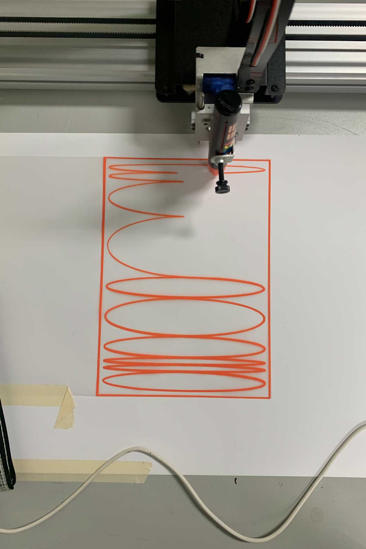
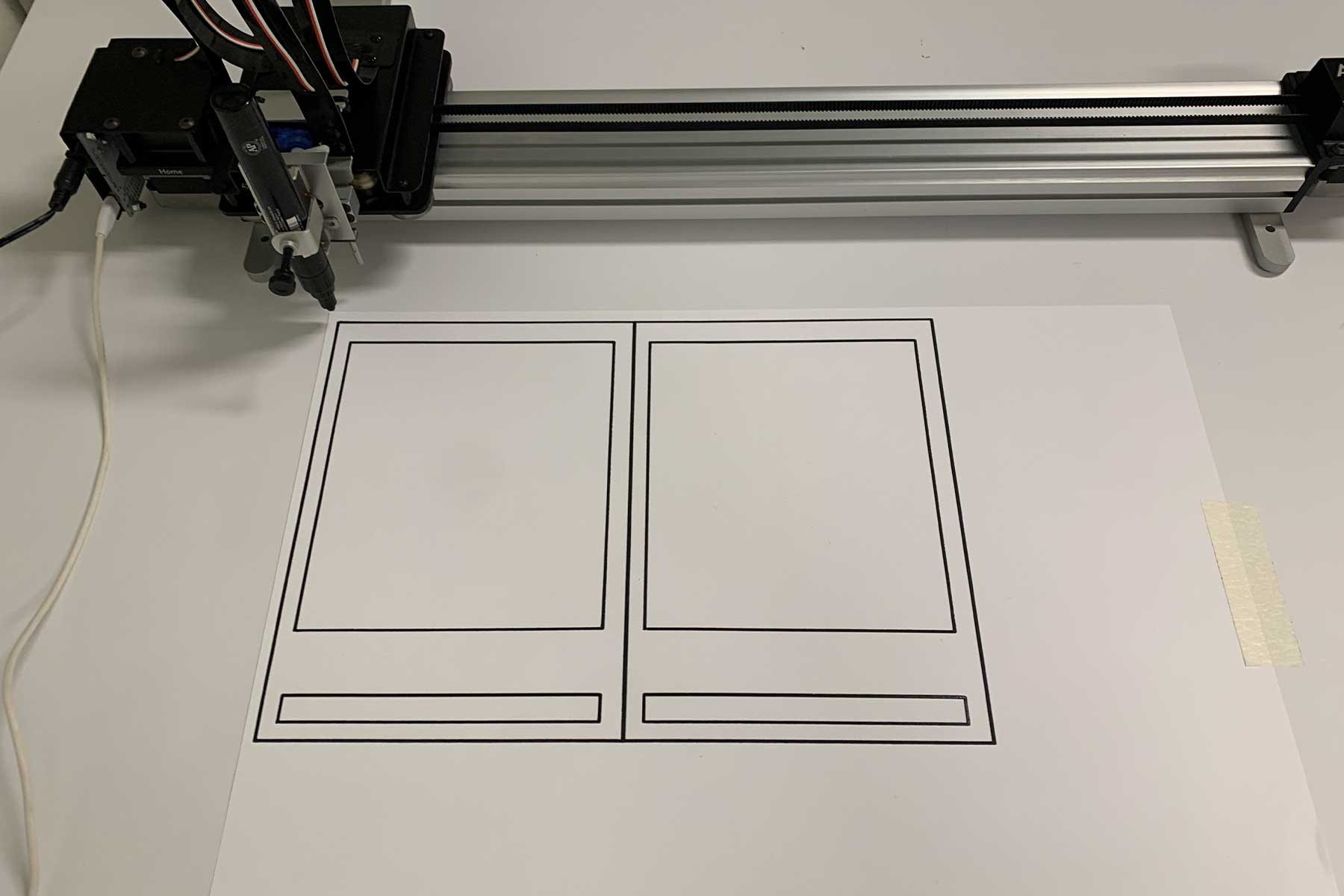
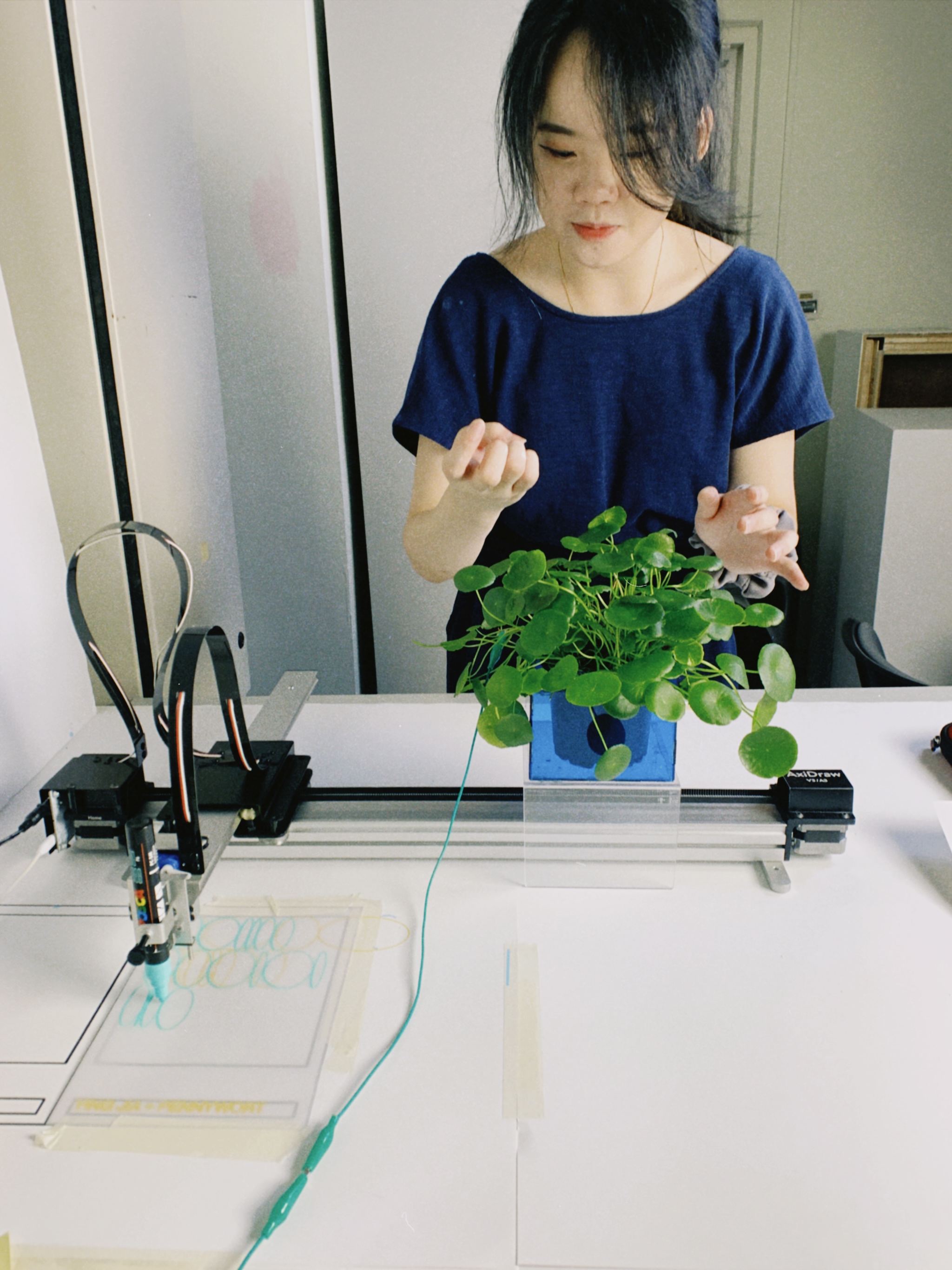
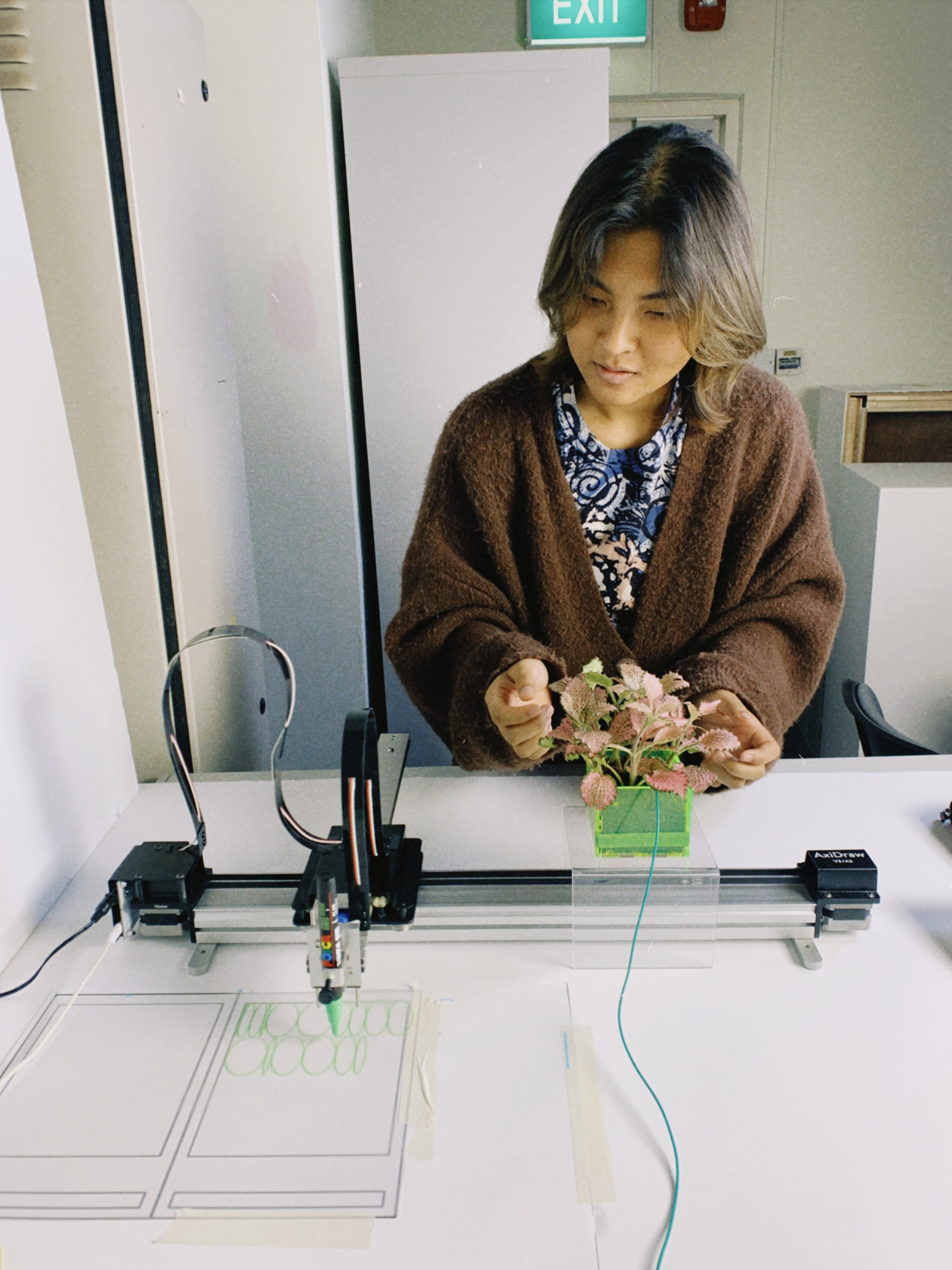
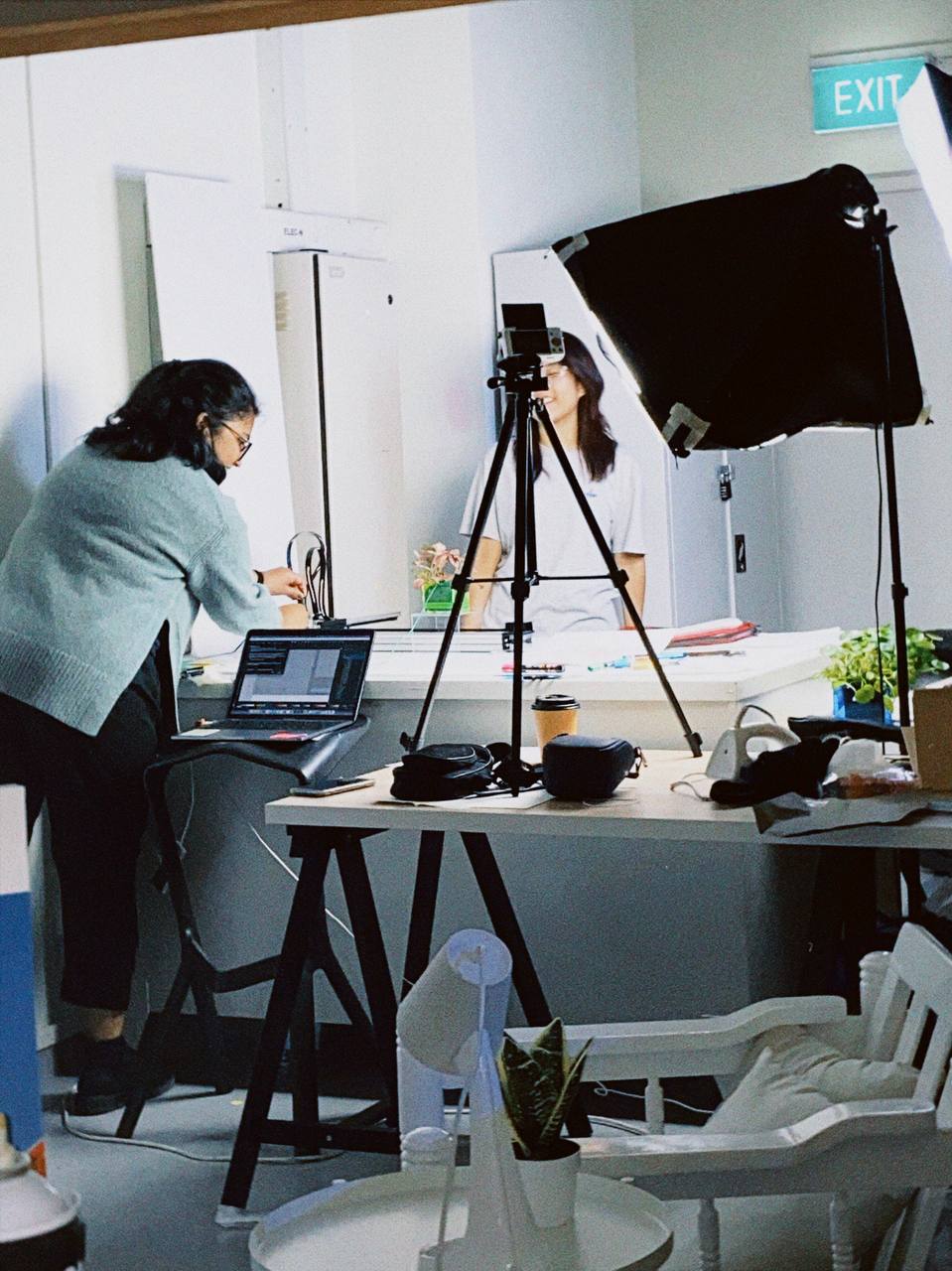
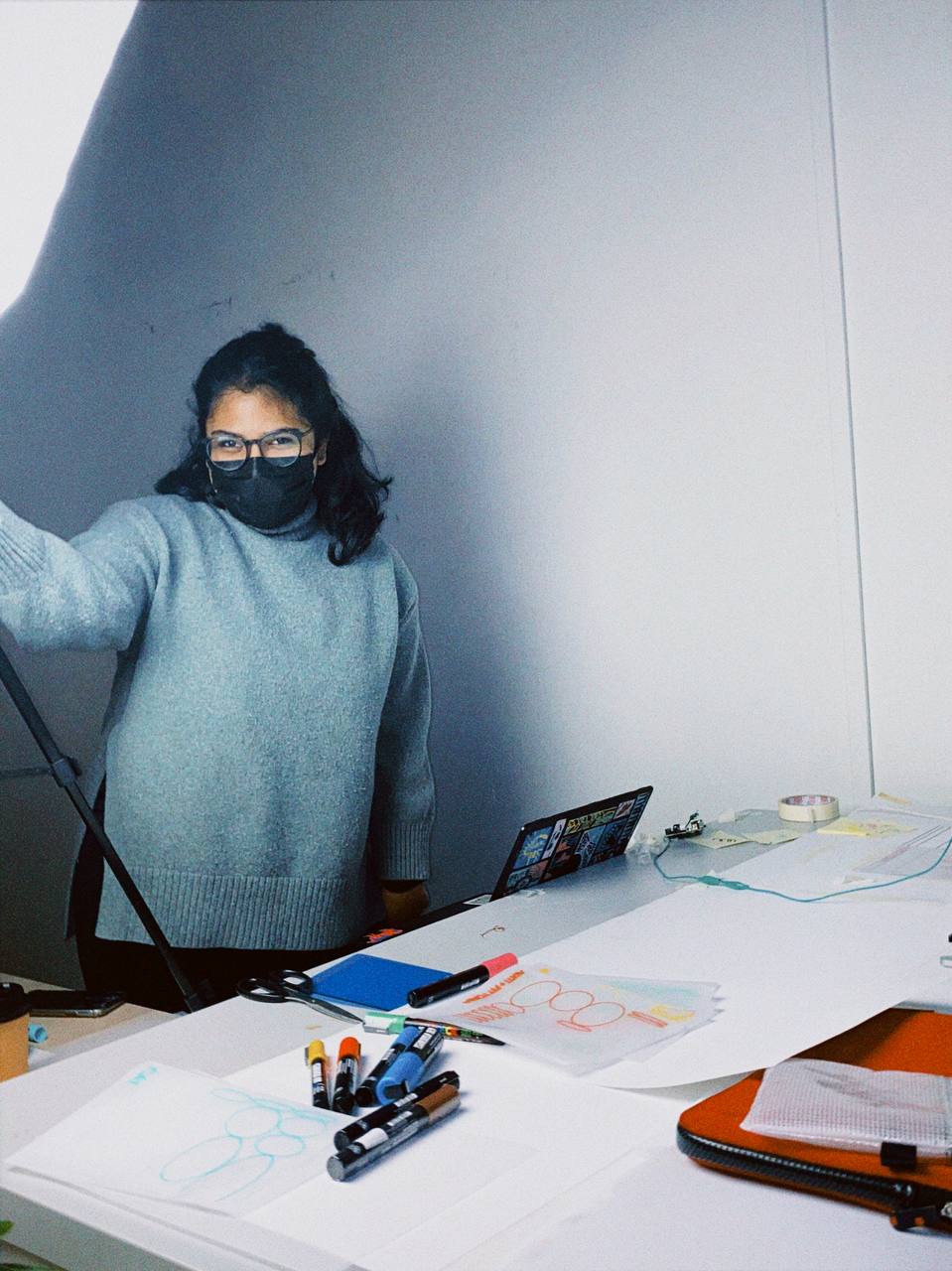
I borrowed the Axidraw from Andreas once again and set it up, calling my friends over to help create some magazine pages. I also drew a framework or guide to place underneath the translucent paper.
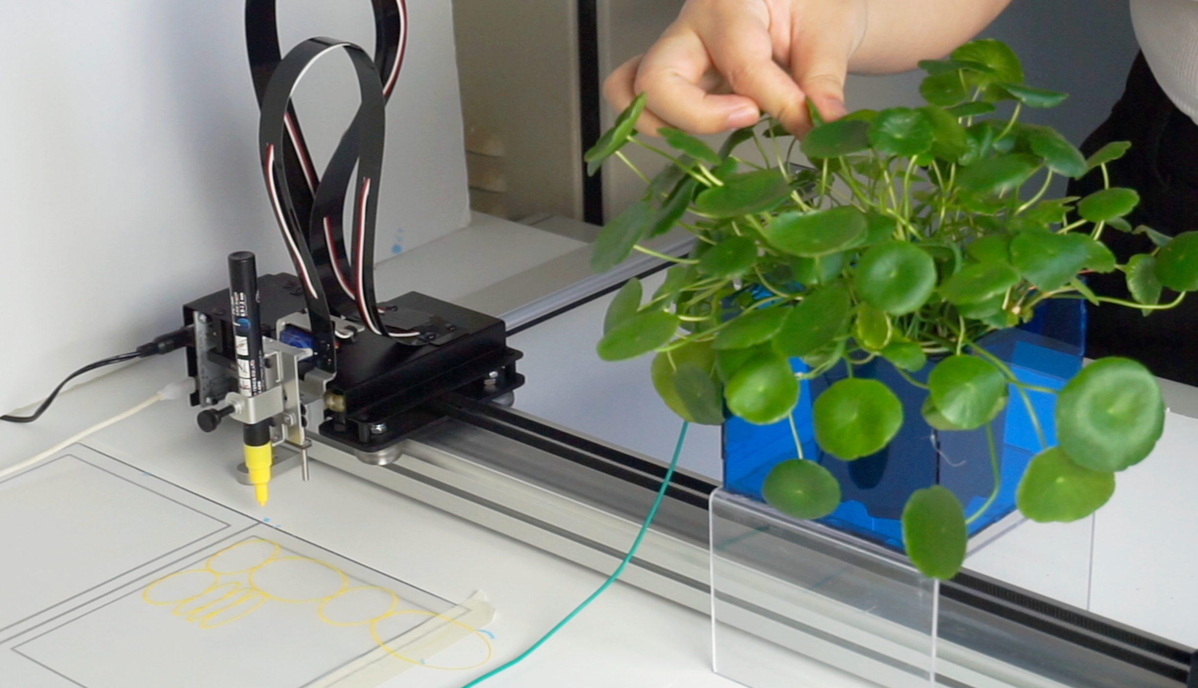
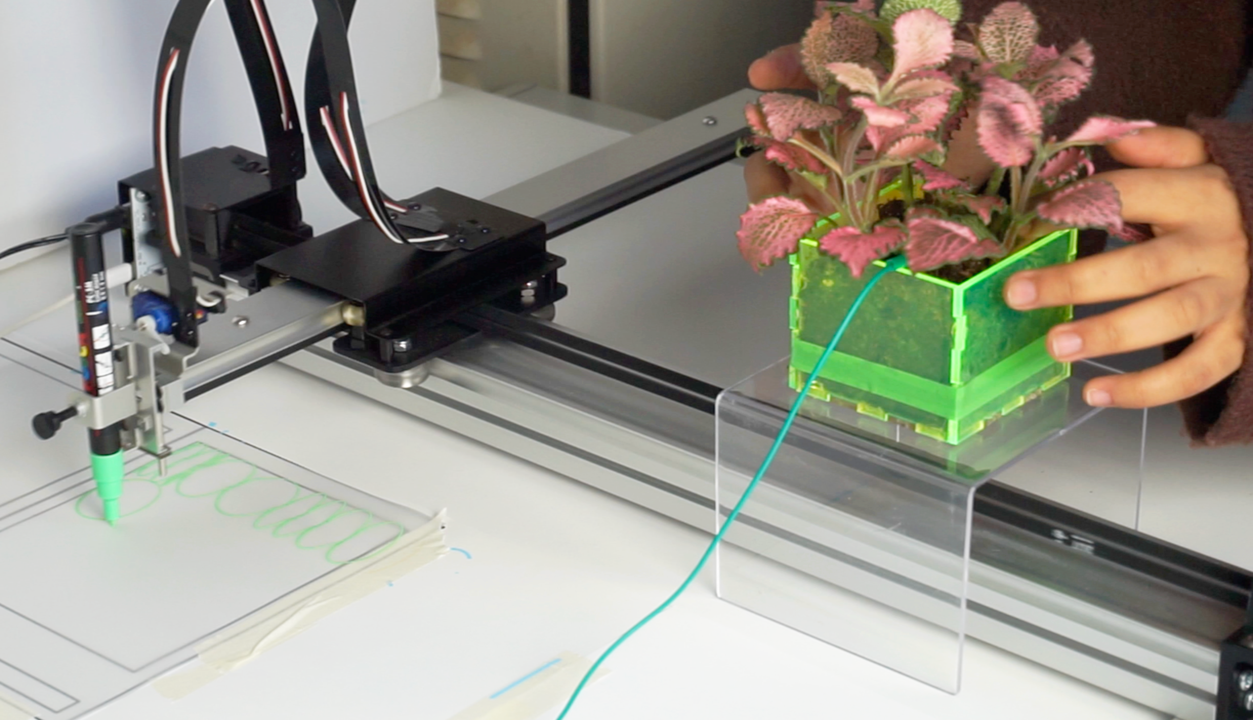
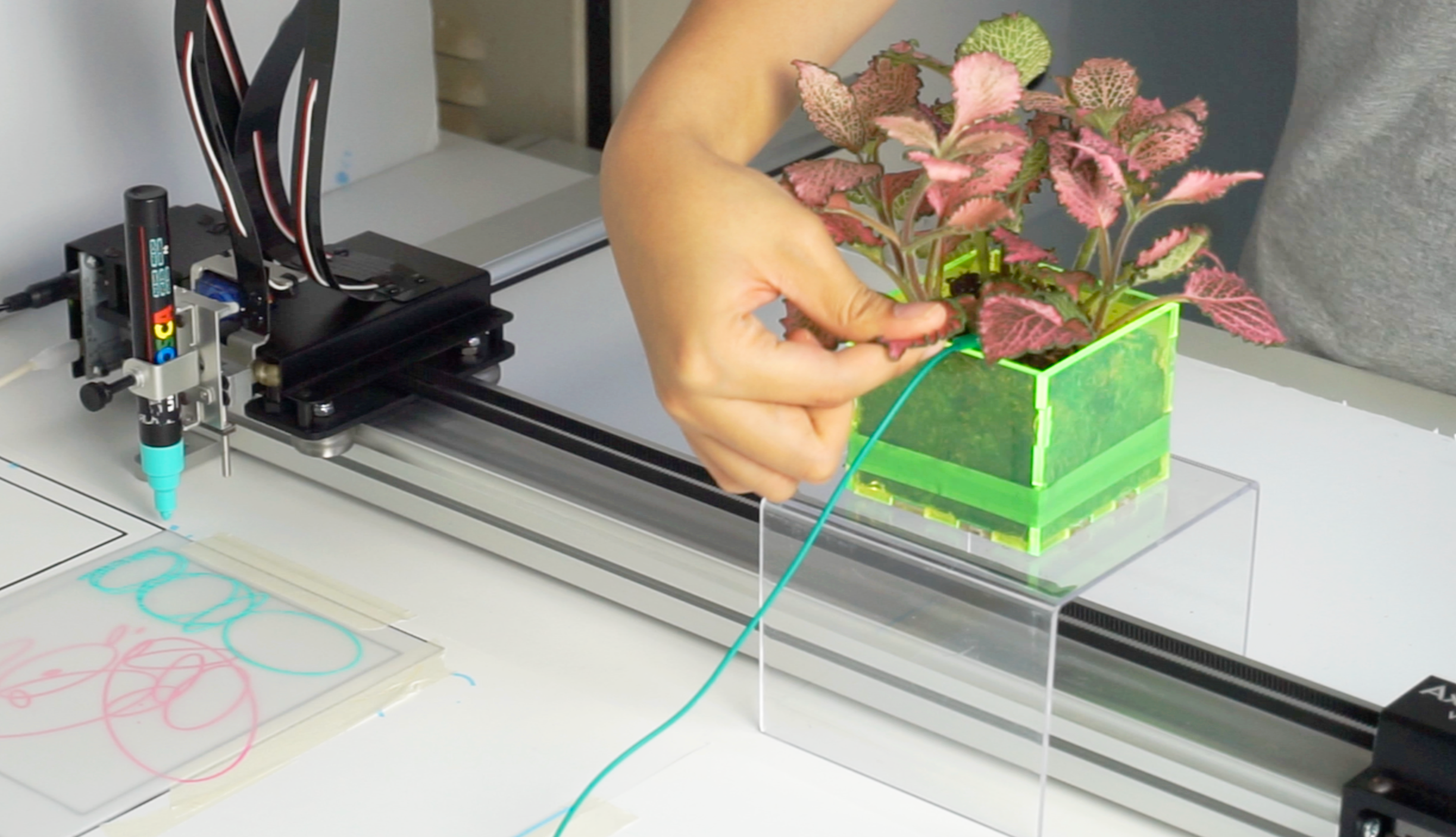
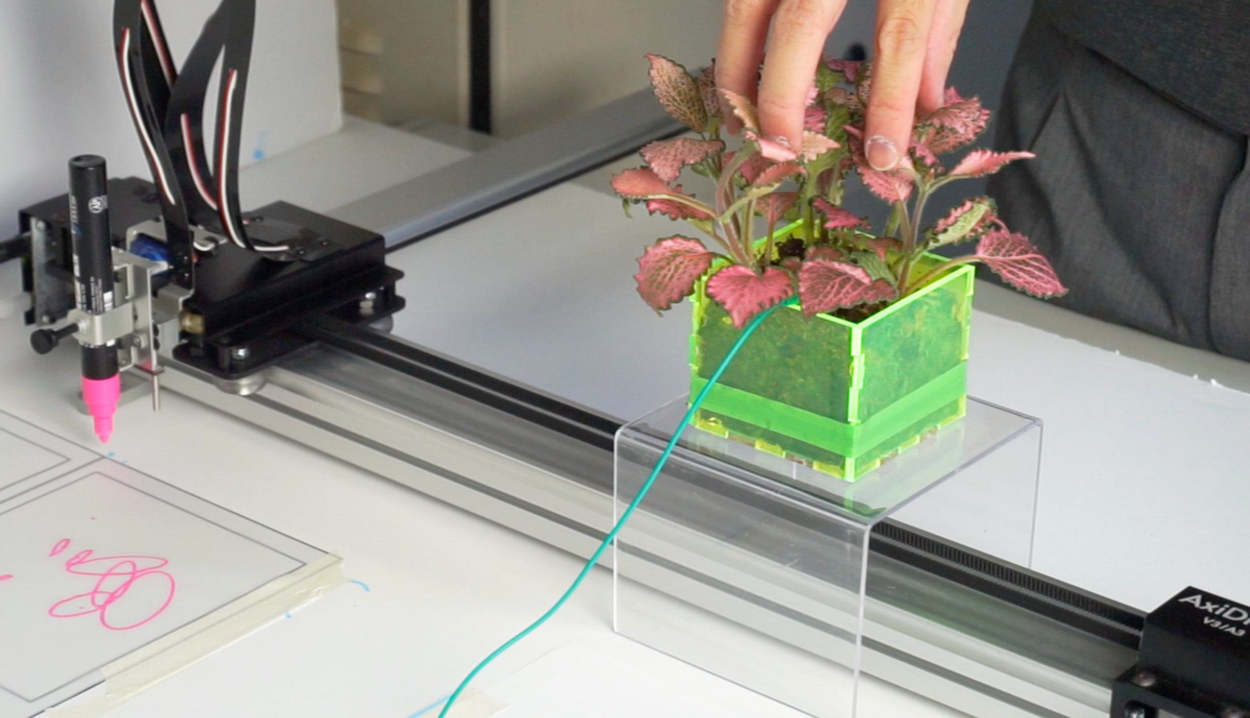
Collating the Zine
Struggled with binding for a bit, but decided to just leave it simple and create a 'loose-leafed' (haha, because plants) zine that is held together by a belt. Asked Sadhna to be my hand model and help me document!
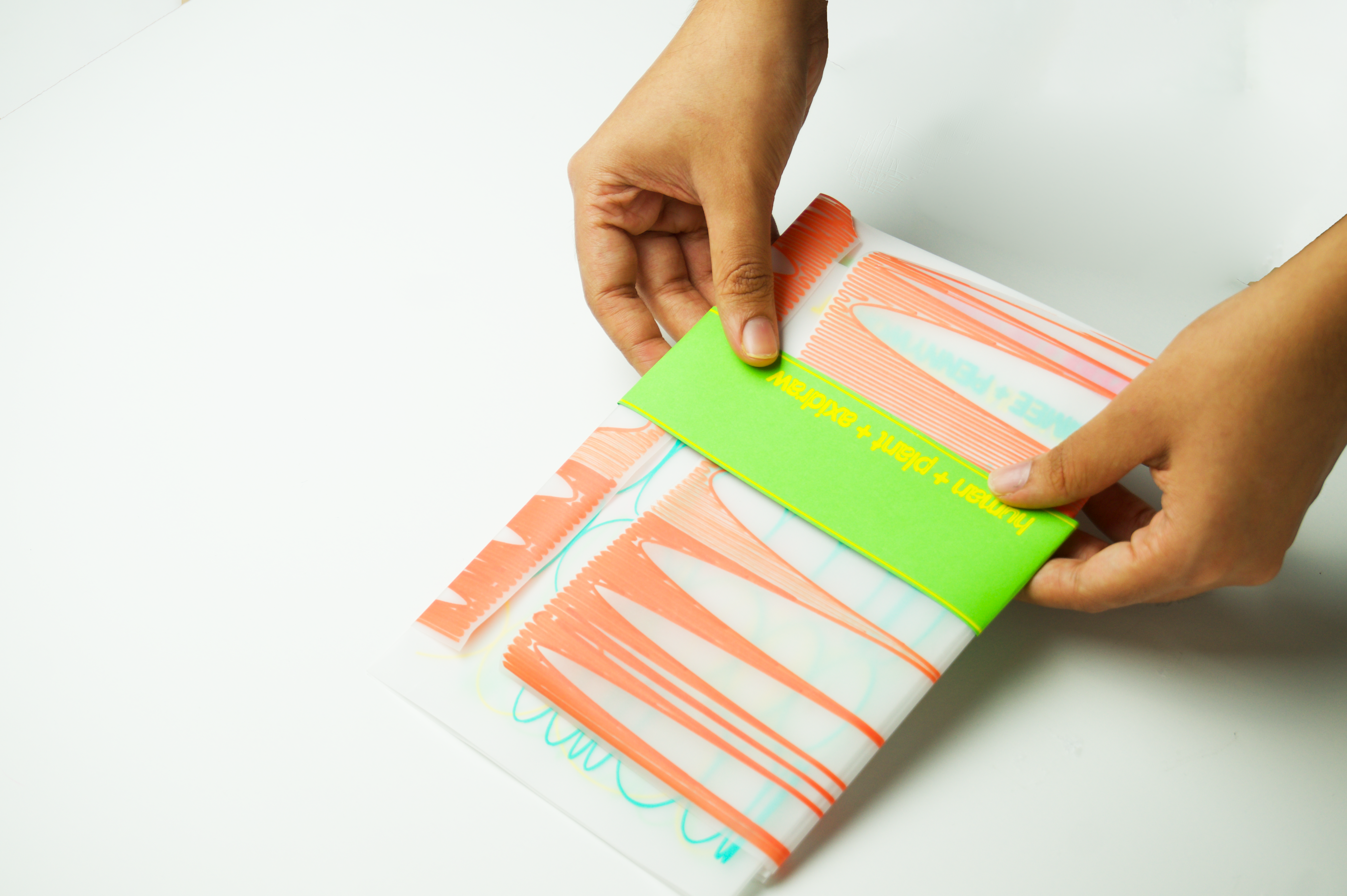
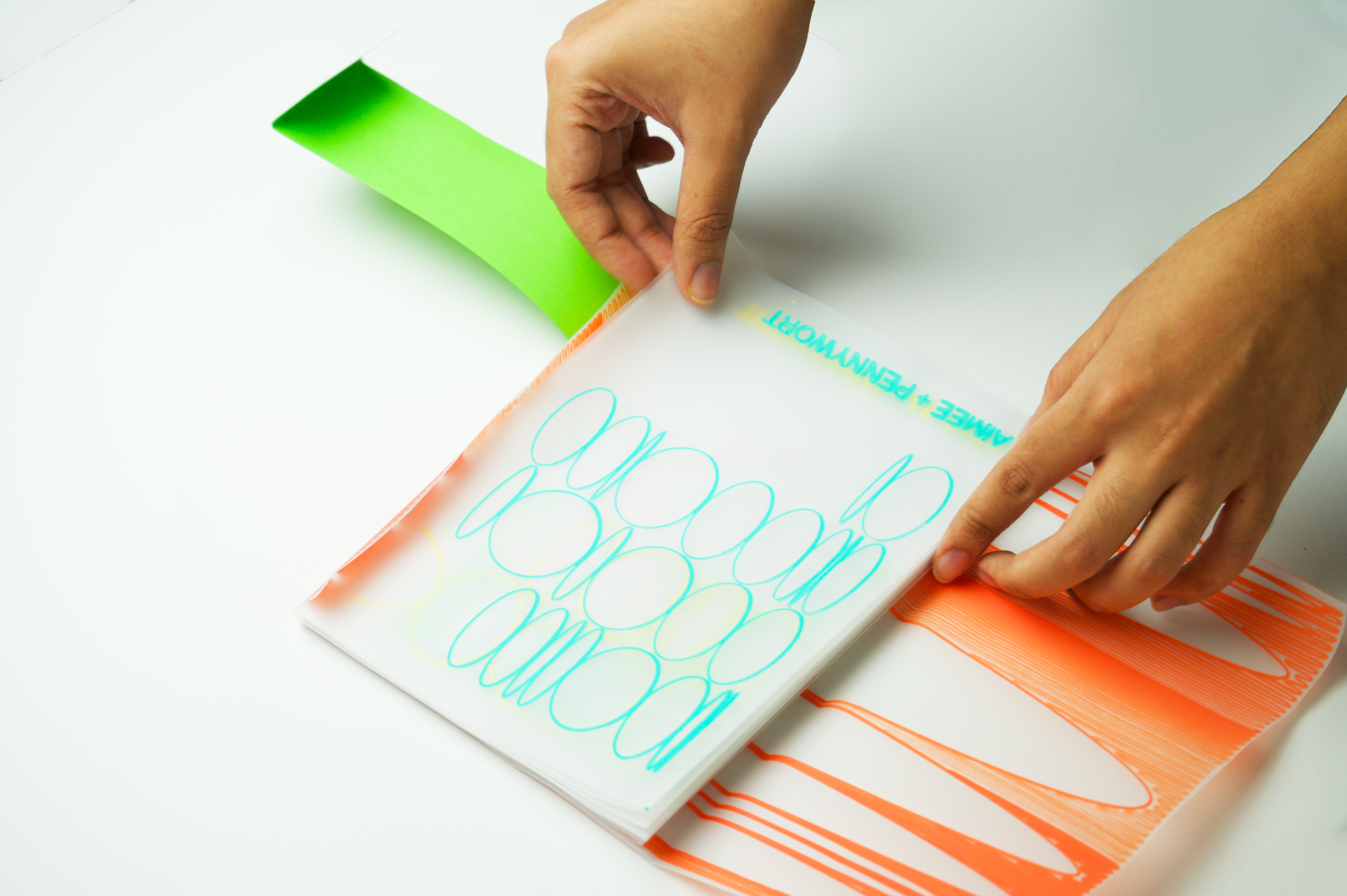
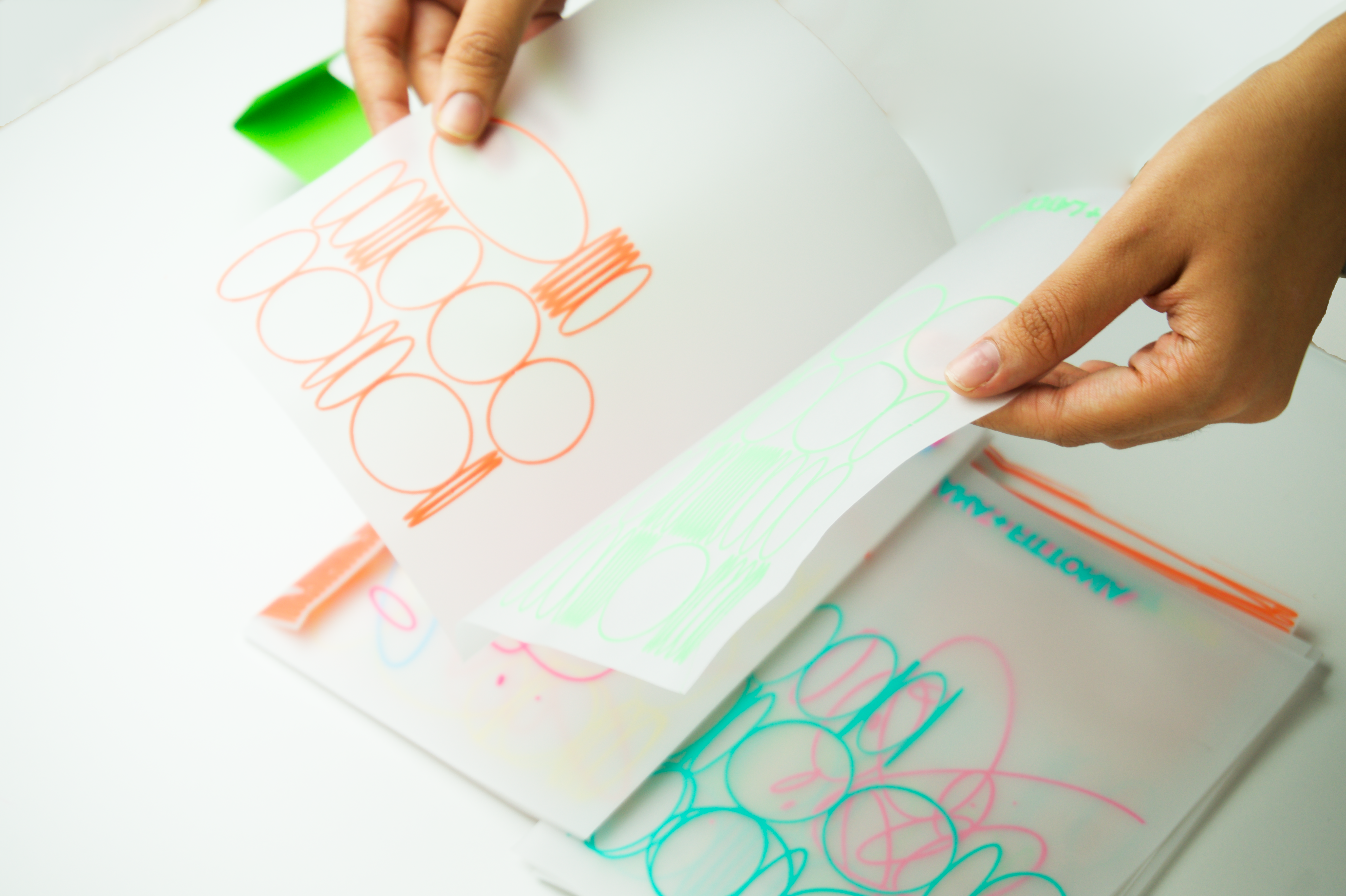
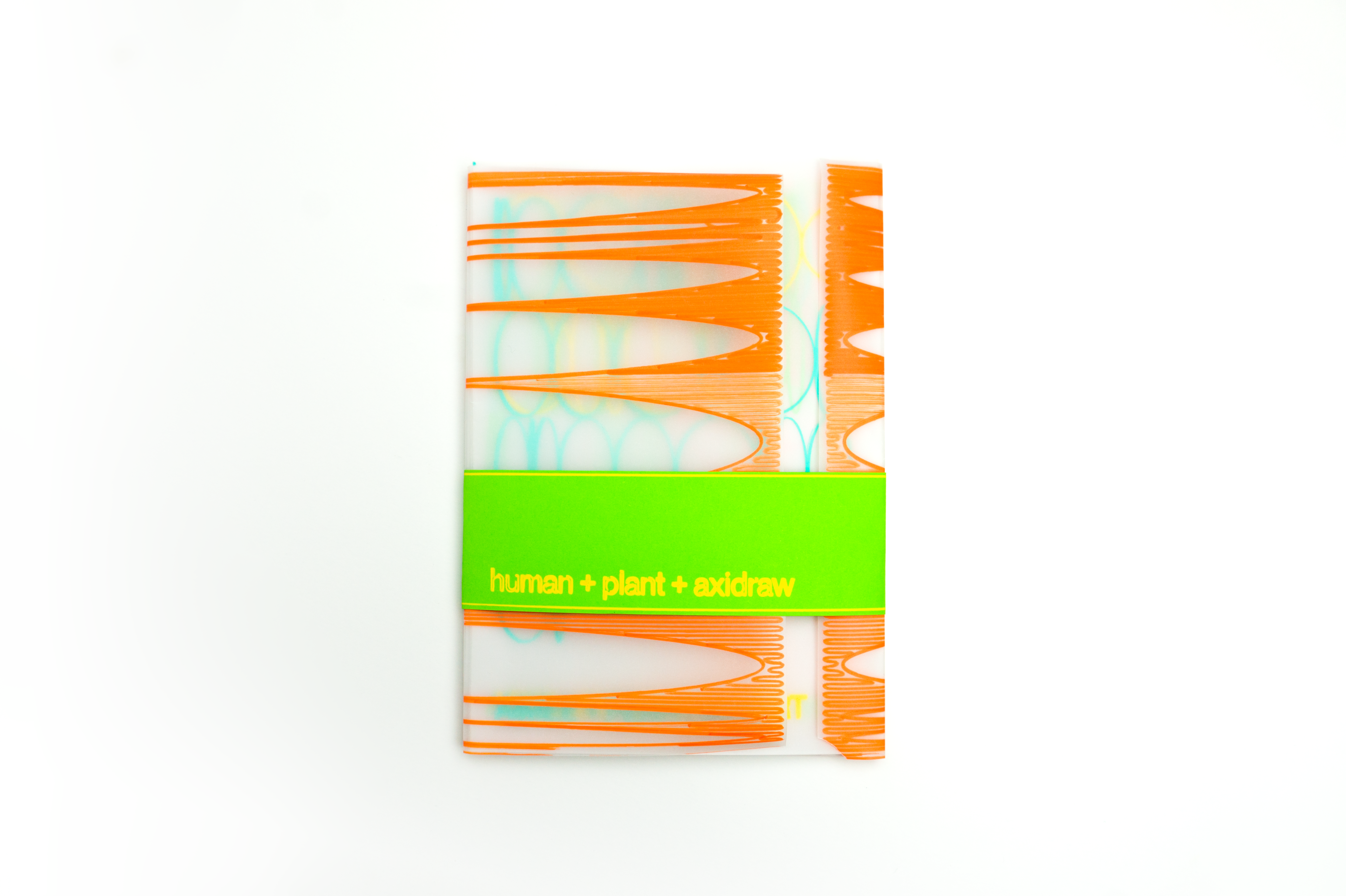
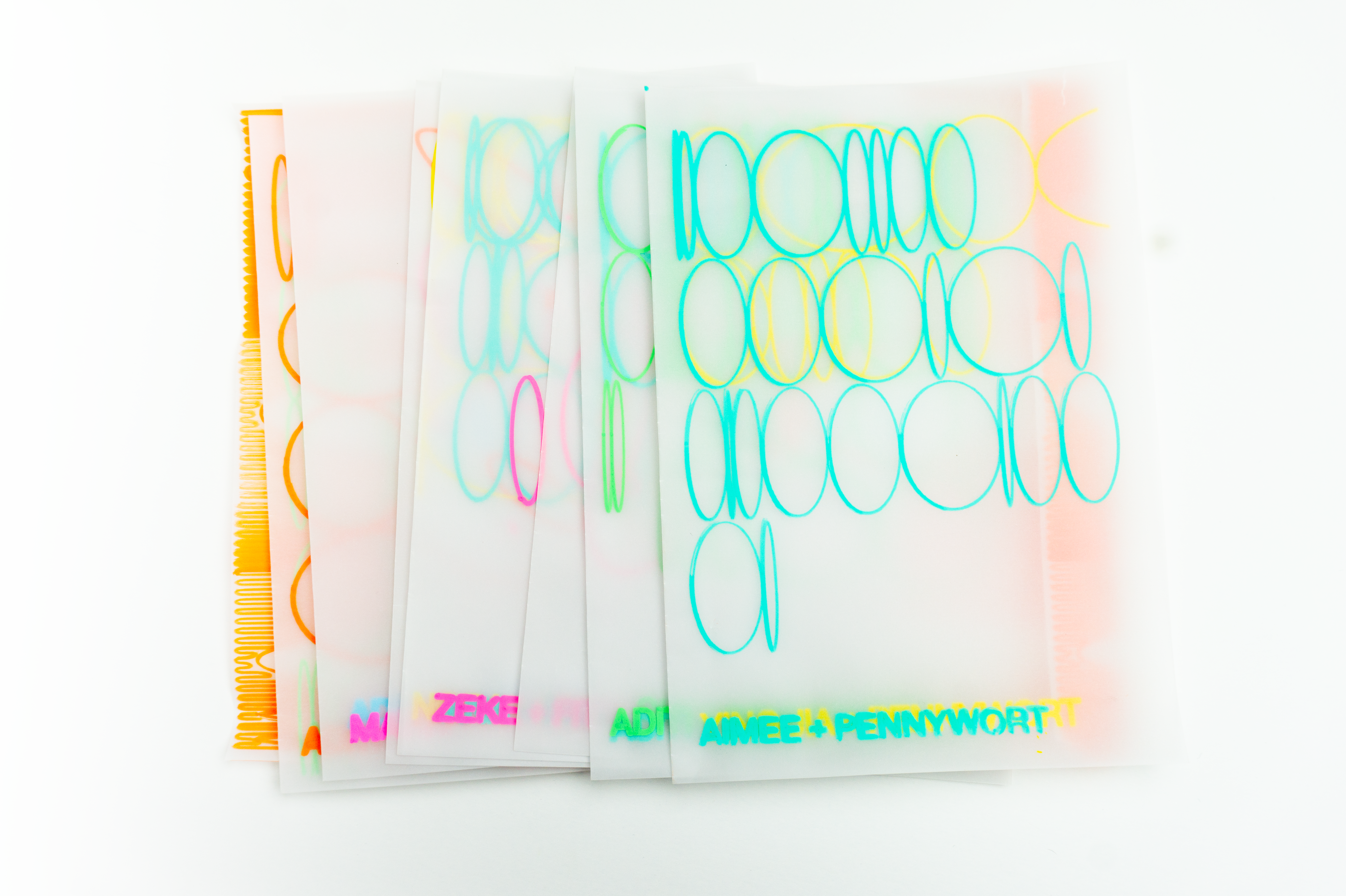
I'm quite happy with how this zine turned out: I think it looks rough and informal without being too scrappy. I also like how the colors work together: I chose to feature an orange for the cover rather than defaulting to my regular blue/green, which adds some energy to the art direction that was a happy surprise.
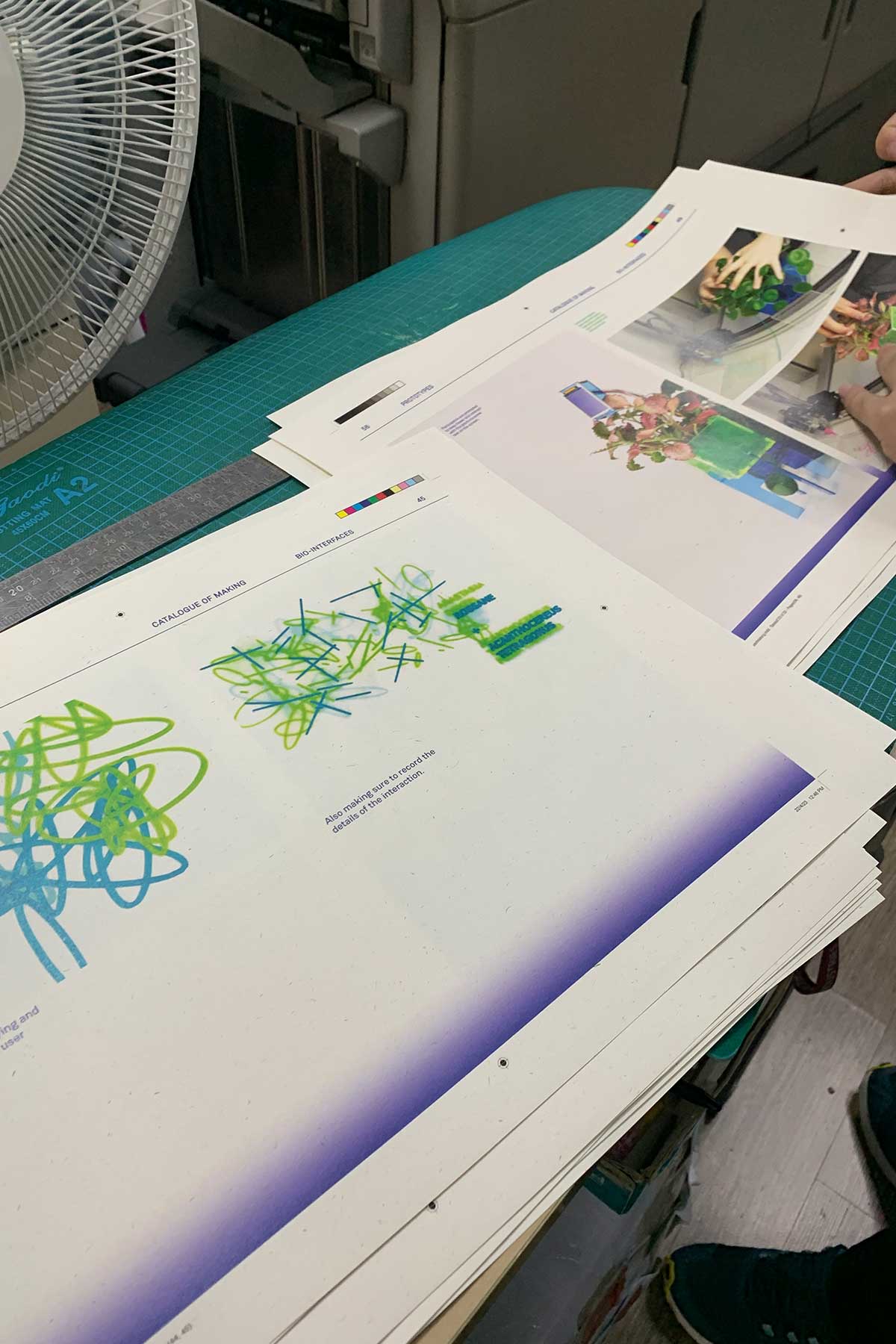
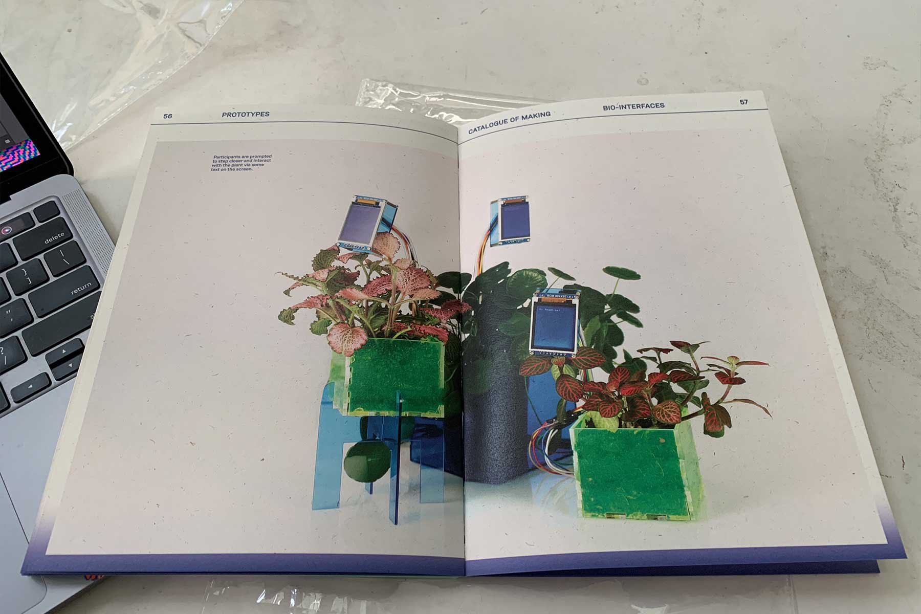
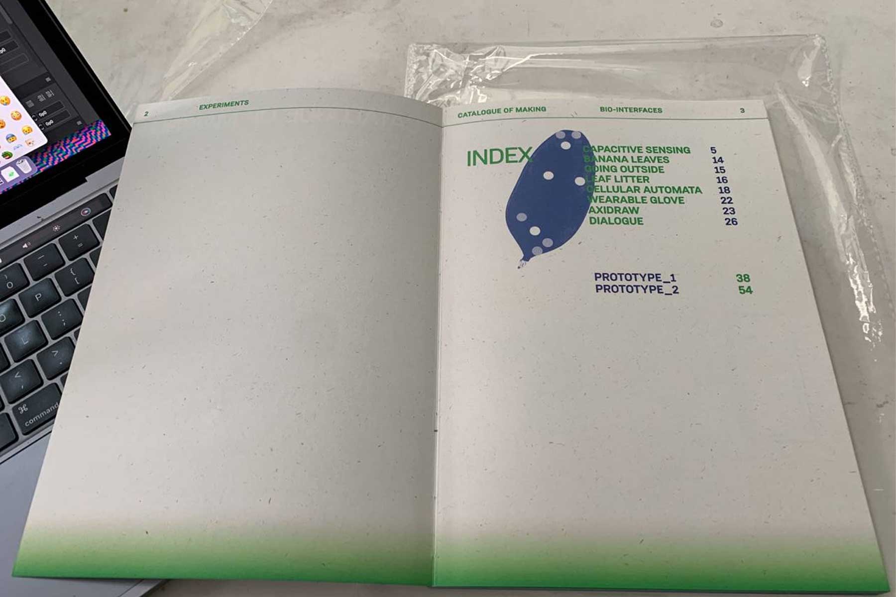
Printing my Catalogue
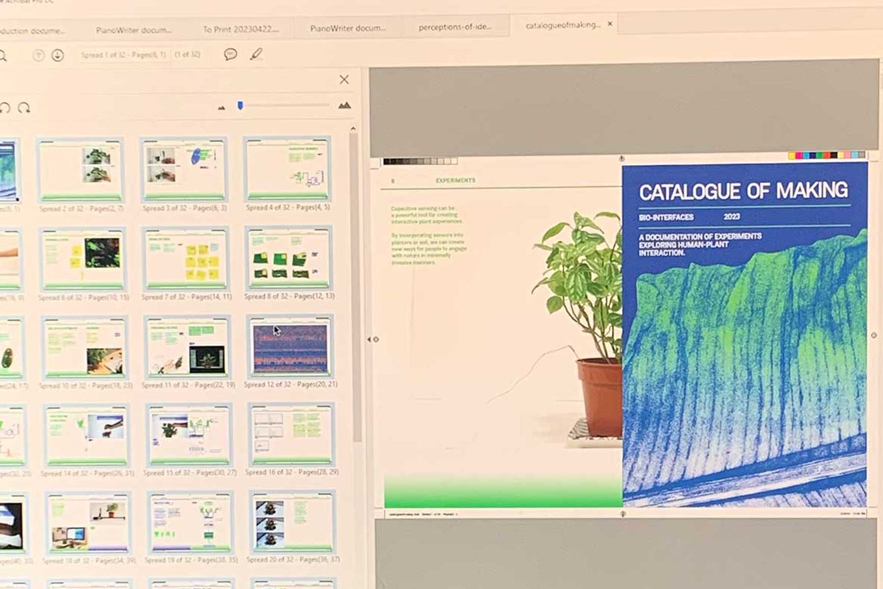
Printing my Catalogue on OK Kaiser White (93 GSM) paper, with coptic binding. I think the paper ended up being a bit thicker that I'd like, but I think the problem resolves itself with the binding. Coptic binding lies flat, so any spreads I had designed would sit quite nicely!
Video and Photo Documentation
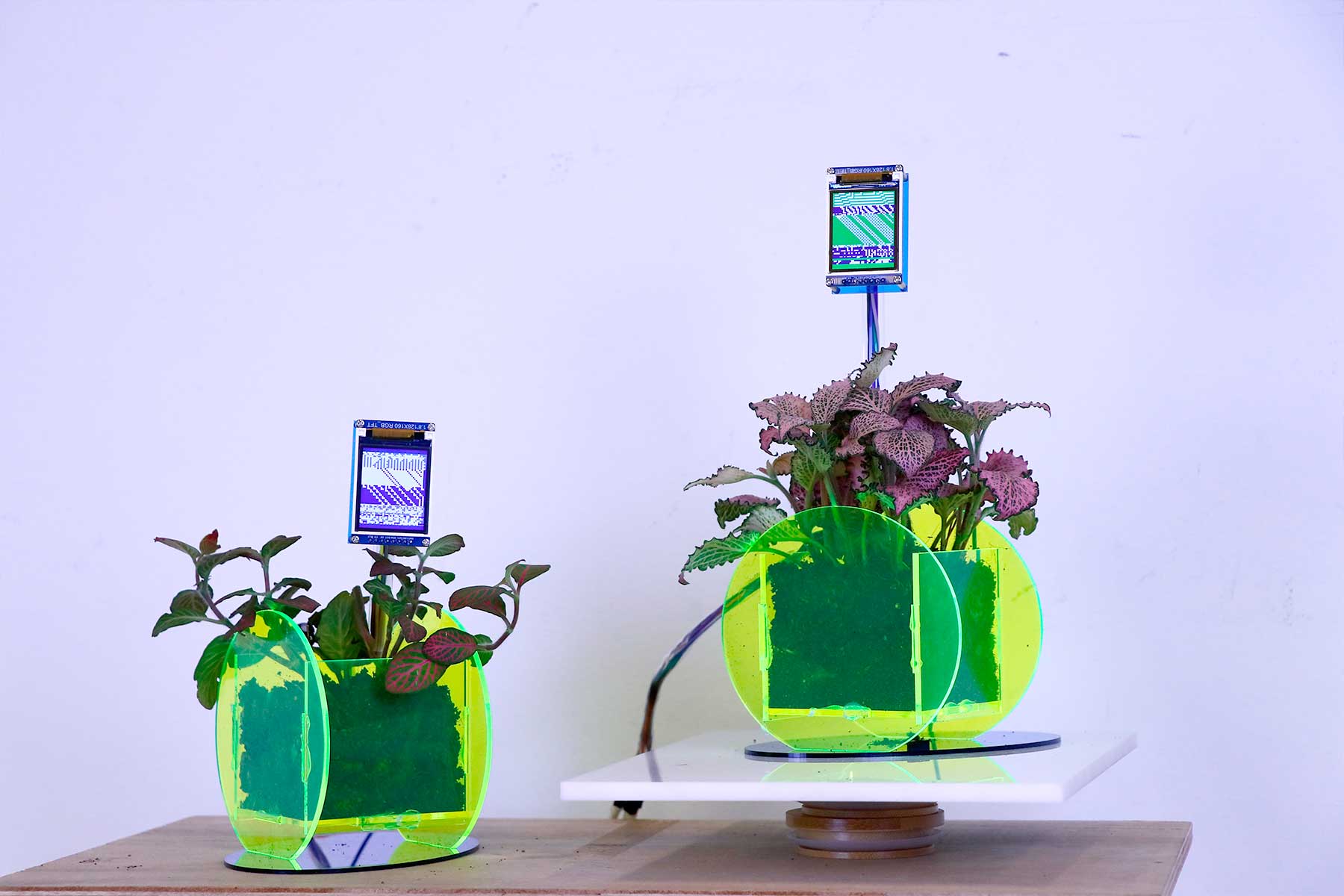
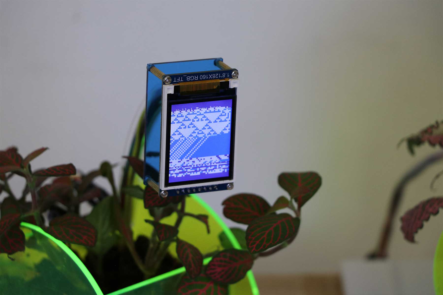
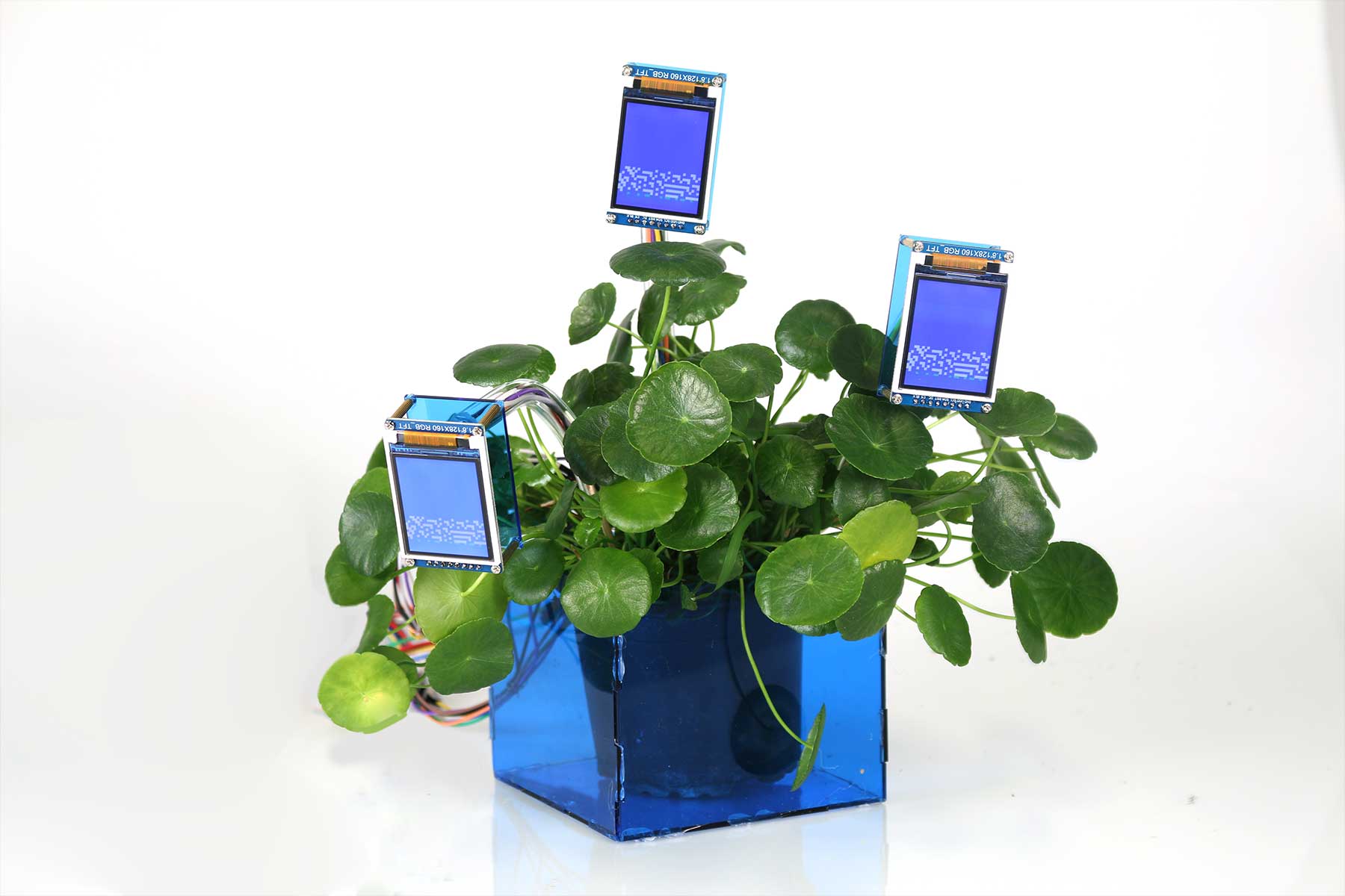
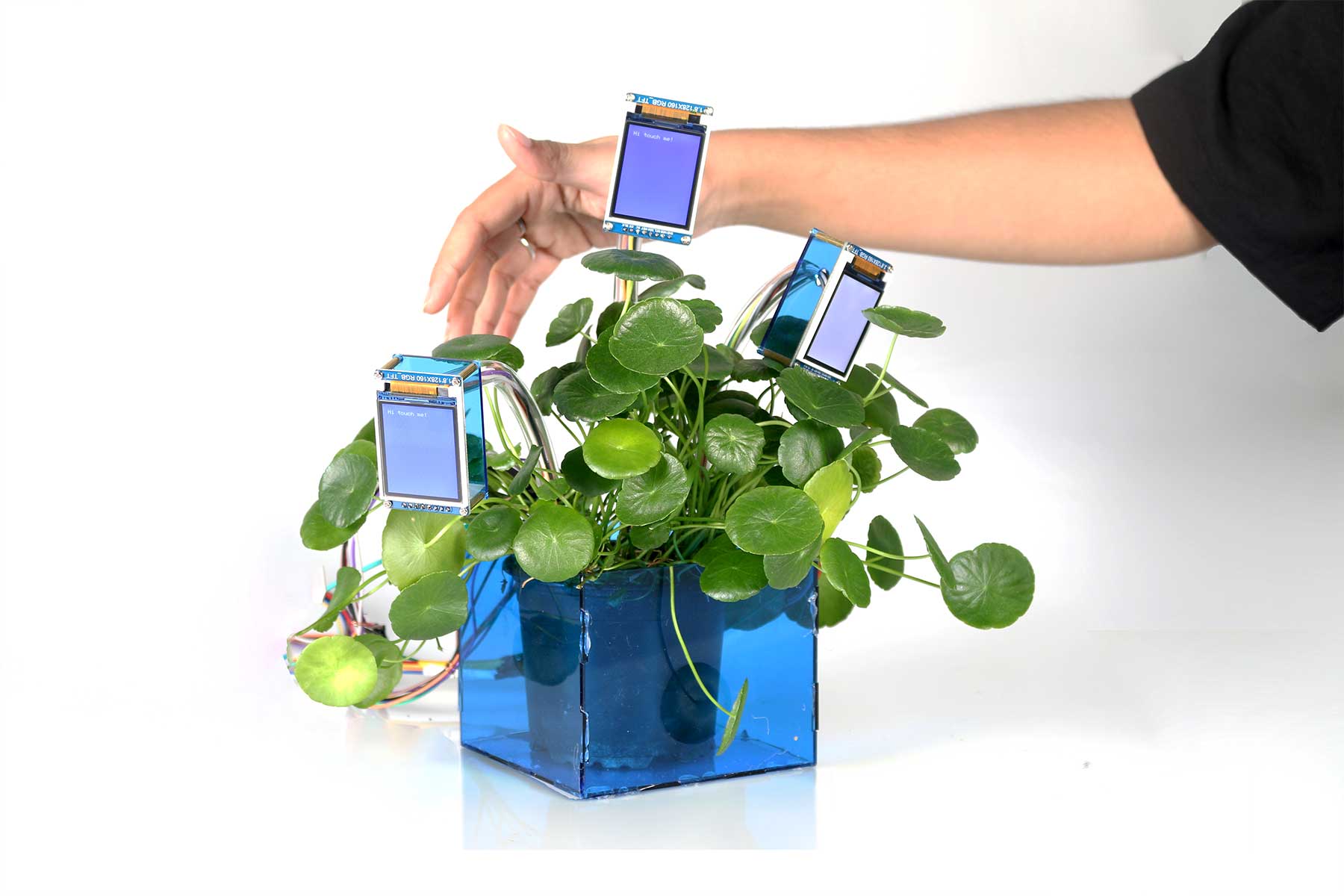
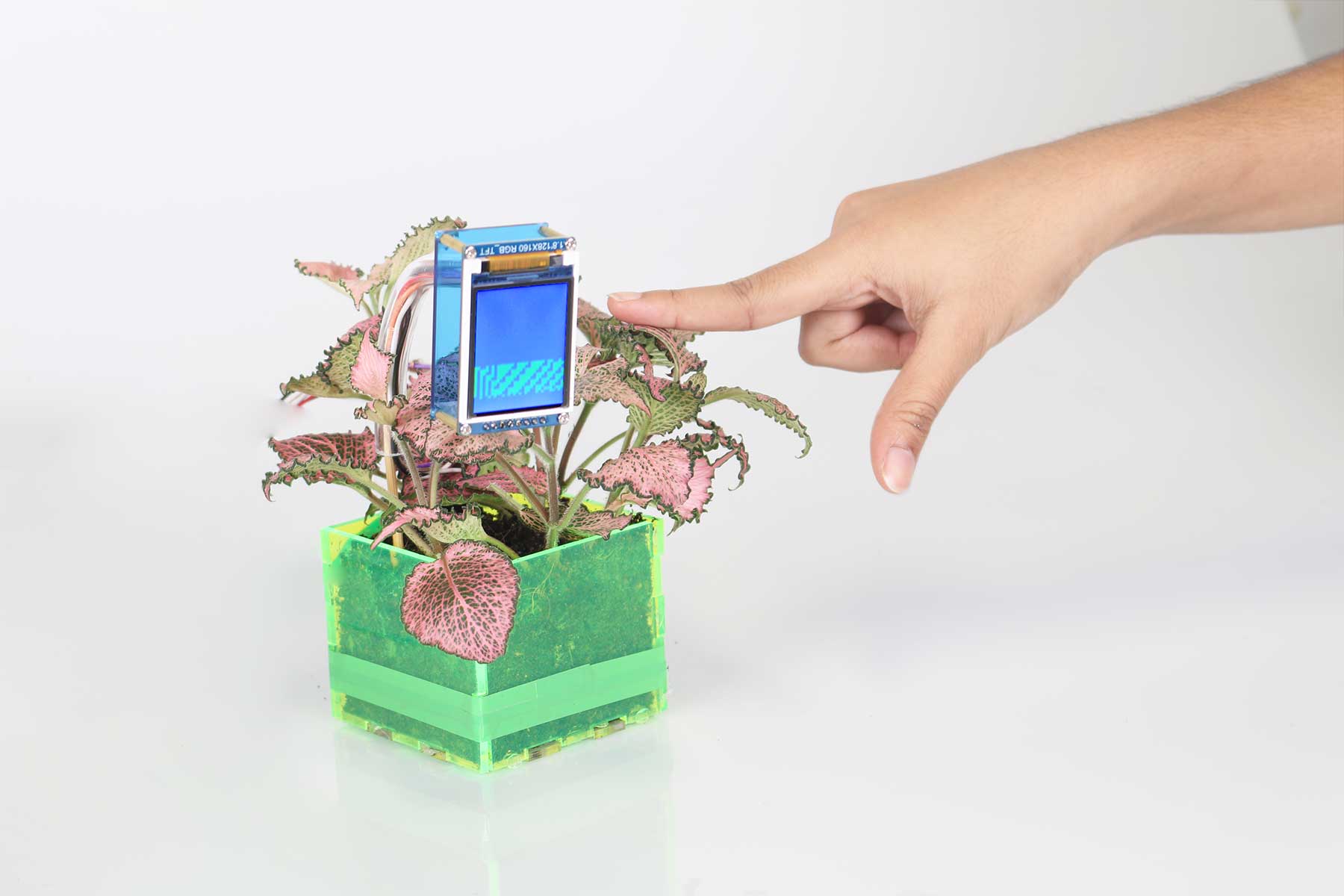
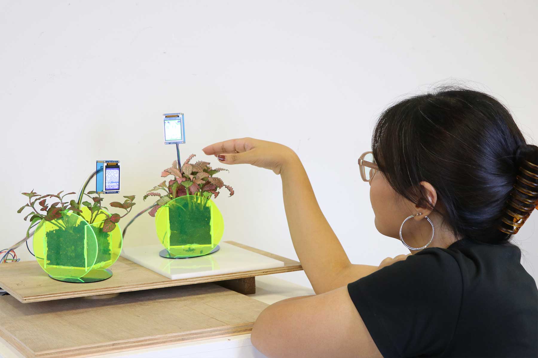
I booked a studio at Winsteadt and set up another mini studio in D501 to document! I used my SONY digital camera (not a DSLR) but I am still quite happy with the results.
Contextual Posters
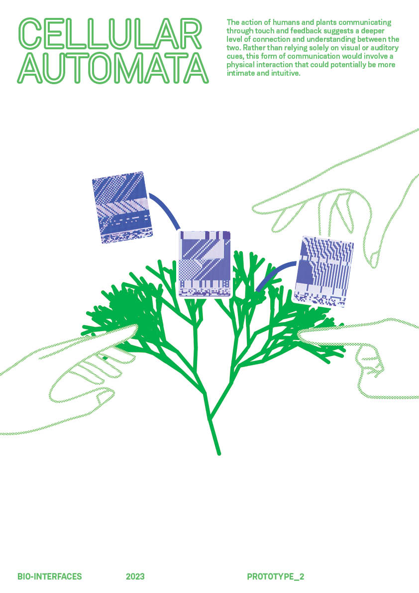
For my setup, I also decided to create some posters that better explain the conceptual thought process behind my second prototype, following the softened art direction. Ultimately, I decided to put up only 2/4 of these because I did not want to have an information overload at my setup.
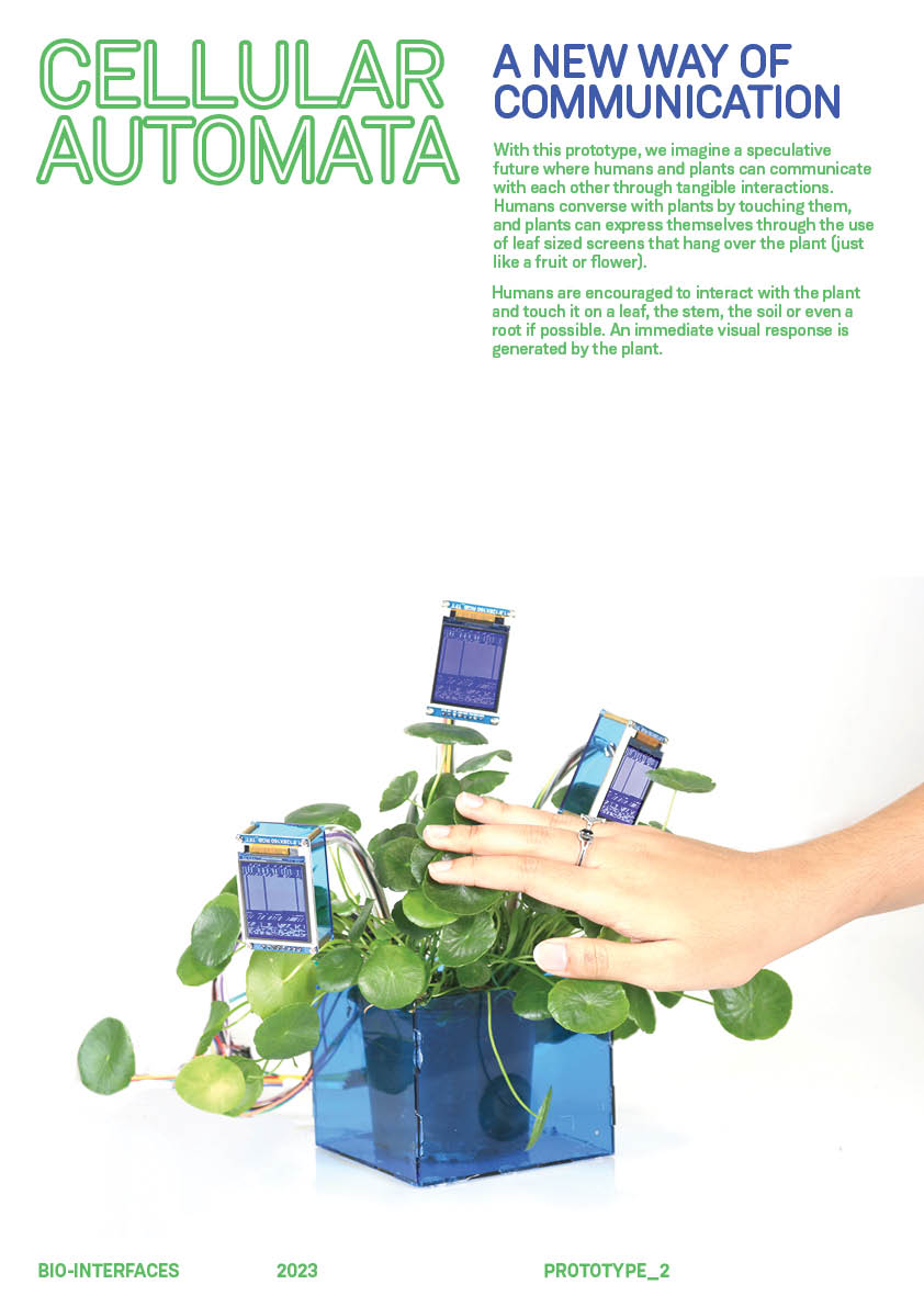
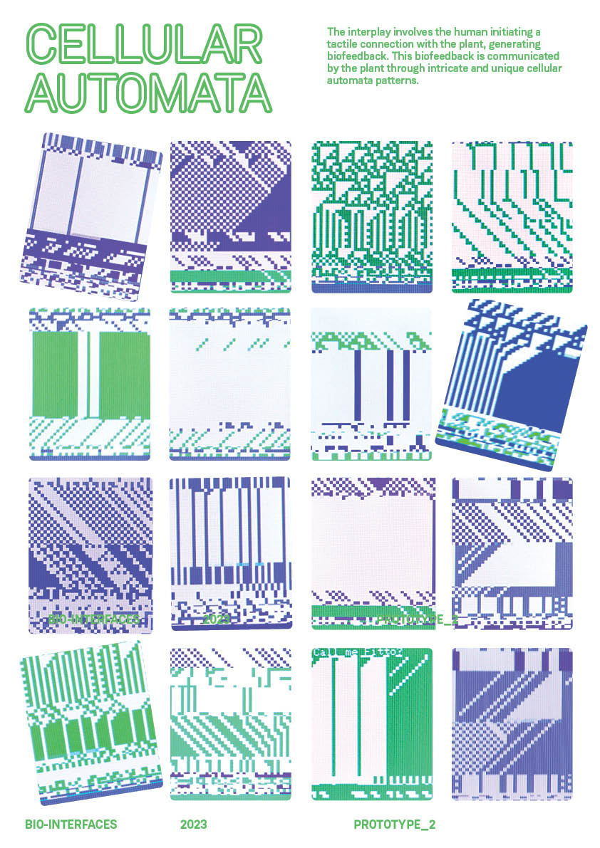
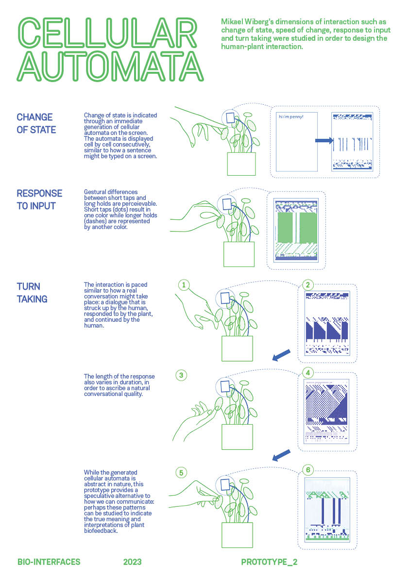
Editng Video
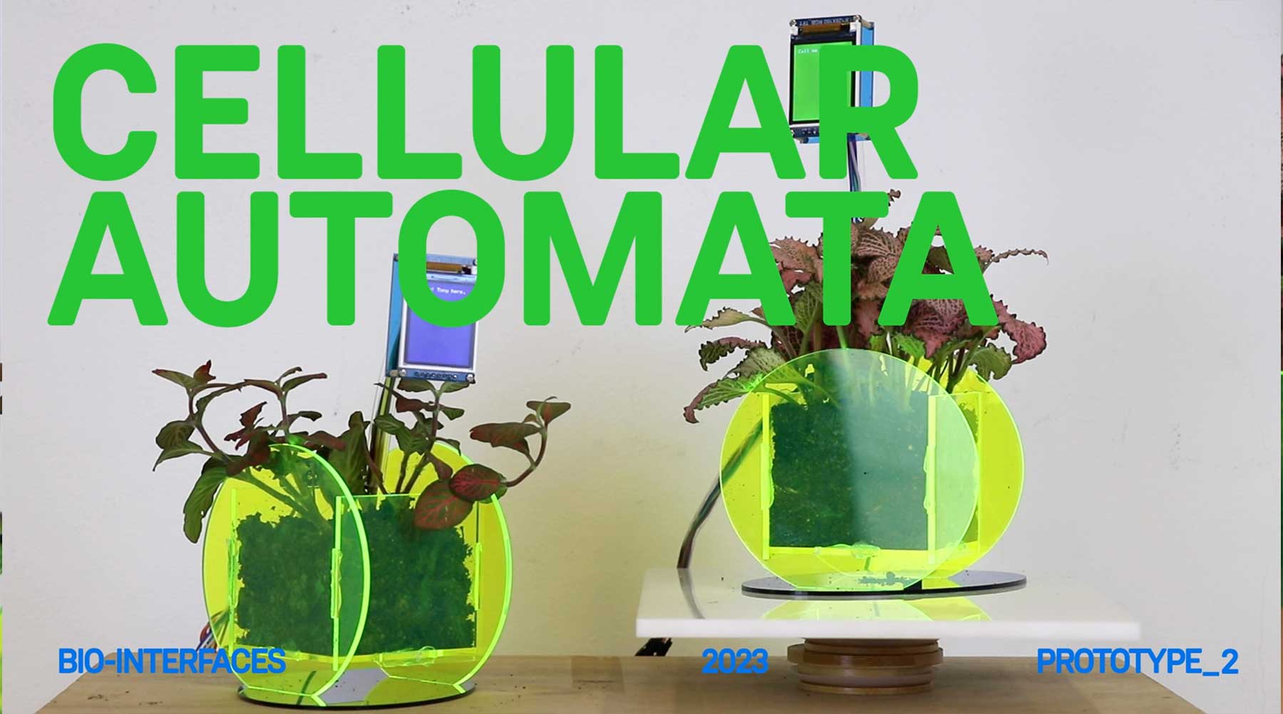
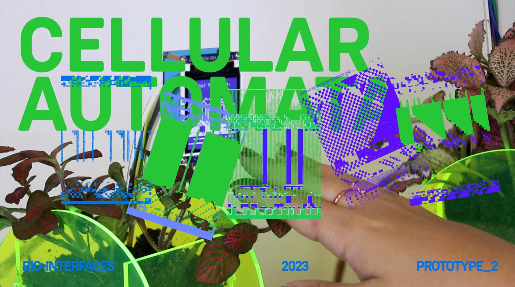
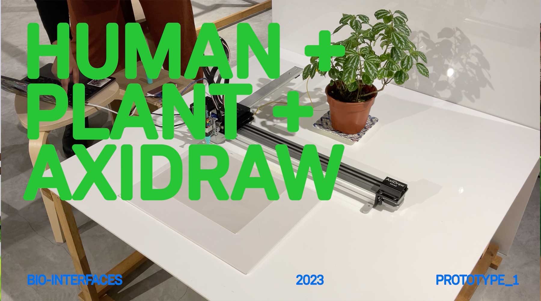
This was done so last minute (the night before subs) so I think it is still extremely rough around the edges. The editting and the music could also change, but for now, there is no time. This is now an issue for Grad Show.
Final Setup
Here's the final setup. I ended up utilising the dividers present in the D5 space to put up my posters. Initially I used cellotape (which obviously did not stick), but borrowed this really nice green tape that went with my color scheme to put them up.
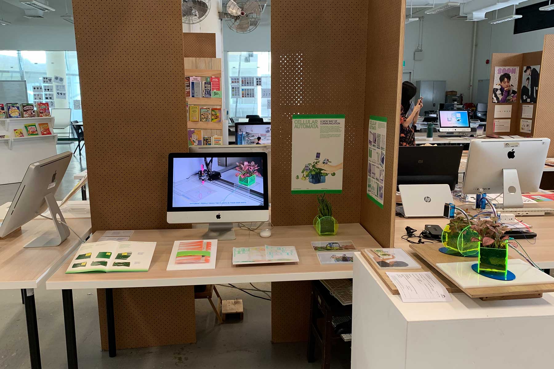
I'm quite happy. It looks clean, elegant and minimal: when presenting, I envision a clear flow that starts on the left and ends at the podium with the prototype on the right. All the best to me!